ZARA Website
Redefining the web presence and simplifying the online shopping experience.
Overview
Background
As a part of my Master's course - Information Architecture, I got the opportunity to work in a diverse team of 6 members. The journey began with a working studio to demonstrate a badly designed website, the areas and scope for improvement in the site structure. In order to evaluate the site structure from user's standpoint, I learnt how to conduct techniques such as Card Sorting, Tree Testing and Usability Testing.
Timeframe
4 weeks
Role
Lead Prototyping
Conducted Usability Testing
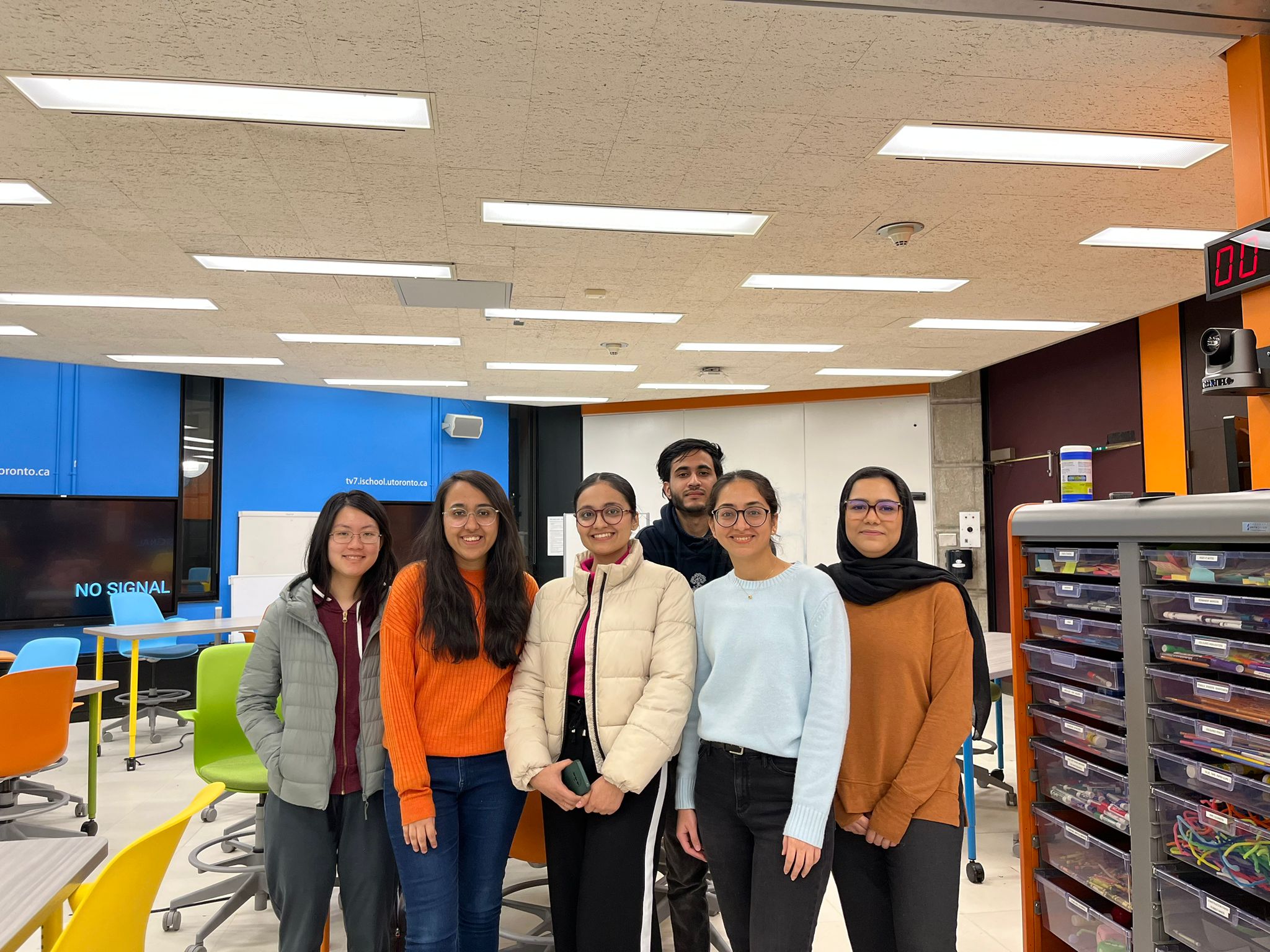
Team
Harpriya (that's me)
Kshitij Anand
Anna Li
Samiha Essakhi
Prabhleen Ratra
Leesha Ramrakhiany
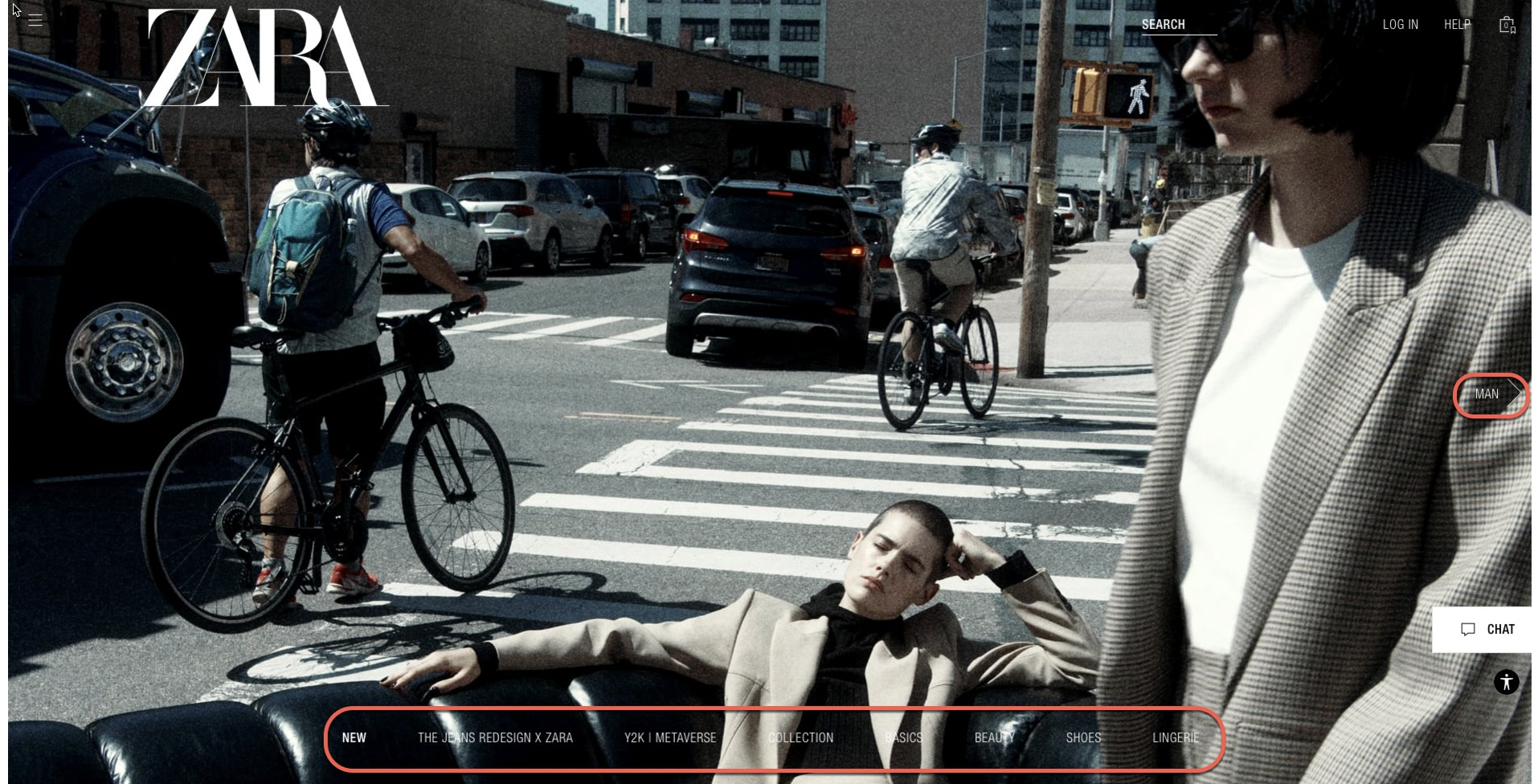
The Problem Statement
What is the reason for such a declining traffic?
A solution that answers this question.
As per current hypothesis, the target user currently struggles due to below reasons :
1. Confusing navigation turning countless users away daily
2. Eye fatigue for website visitors
3. Low flexibility to update cart items
4. Contrasting images and text ratios
5. Misleading product images
6. Constant use of jargon
Tools
MIRO
Figma
LucidChart
Optimal Workshop
Treejack
Deliverables
Content Inventory
User Research & Analysis
User Flows
Card Sorting
Tree Testing
IA Schematic Diagrams
Low Fidelity Prototype
High Fidelity Prototype
Usability Testing
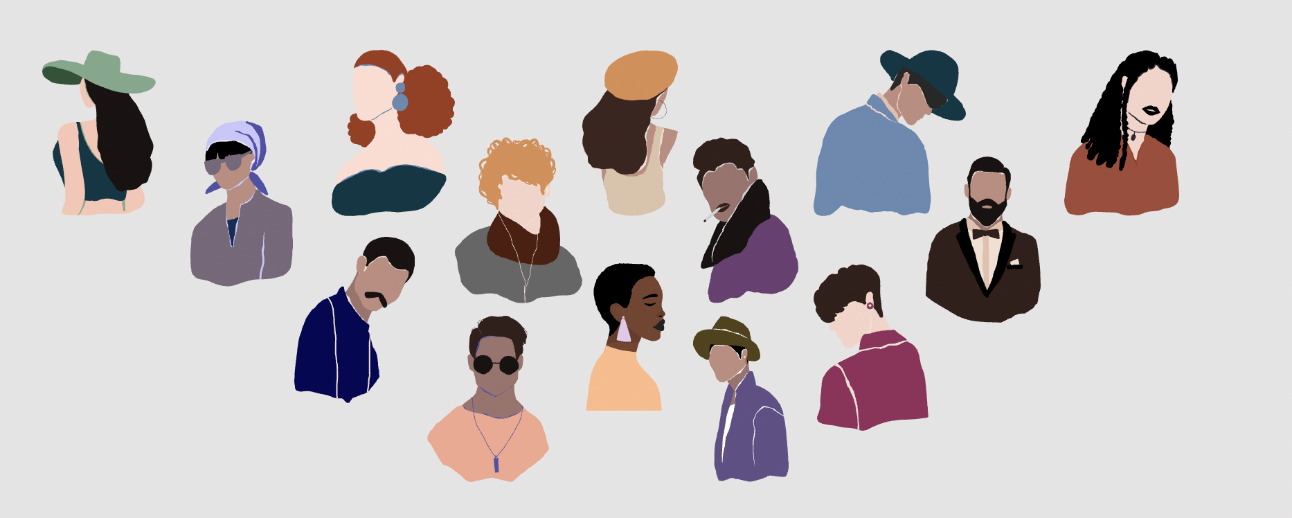
Target Audience
18-40 year olds
Low-to-mid income level
Our Philosophy
"We wanted to sense the pain and struggle the current users were going through while browsing the website, while upholding the current brand identity & editorial look and appeal of the website. Preserving the magazine kind-of view is important as it tries to replicate what physical magazines meant to people earlier. We want to emphasize on enhancing its usability than aesthetics so that it becomes an easy-to-navigate and user-friendly experience."
How did we advance towards design?
The design process
What factors informed our design decisions?
Some Background Research

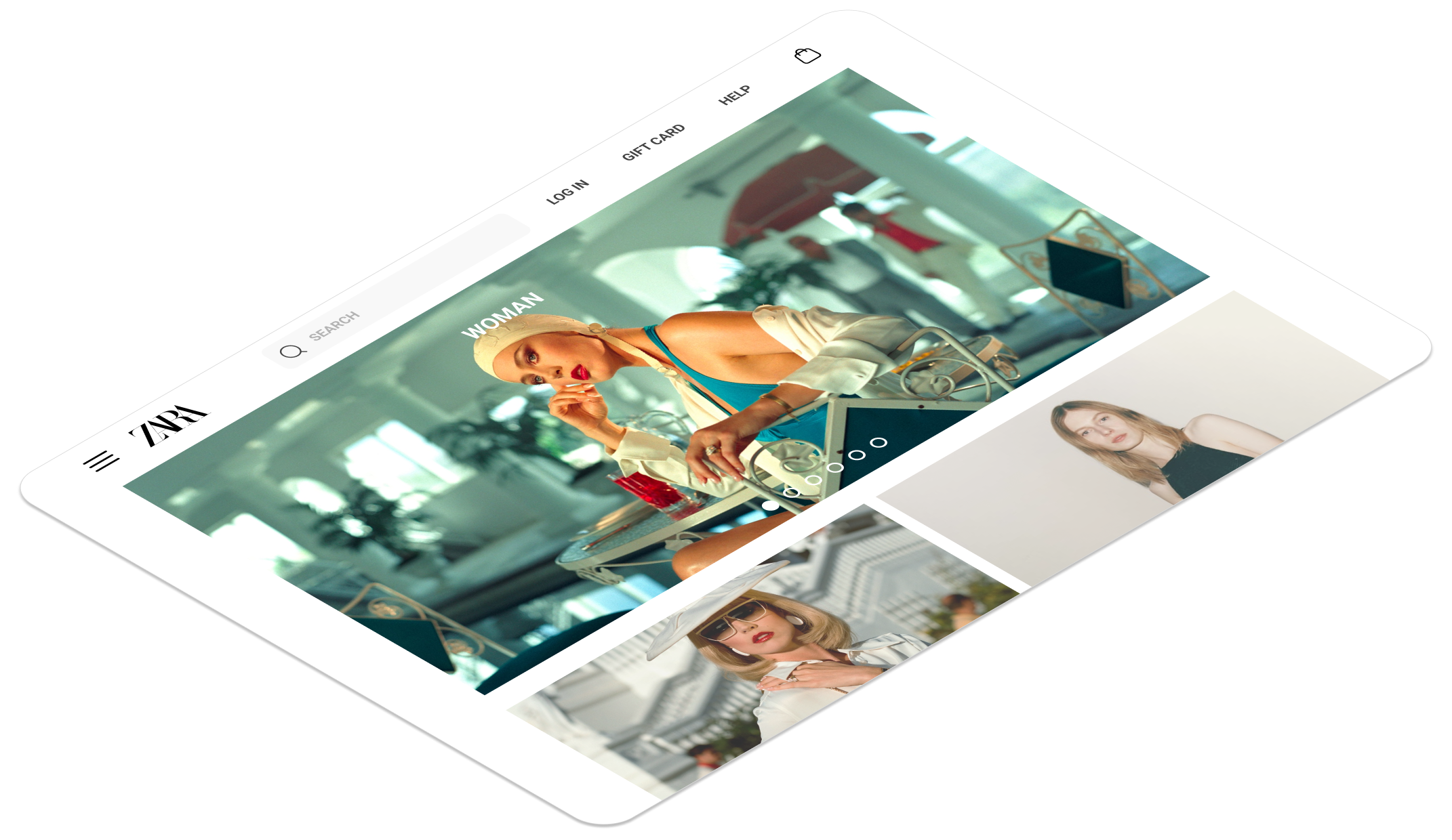
High fashion editorial feel
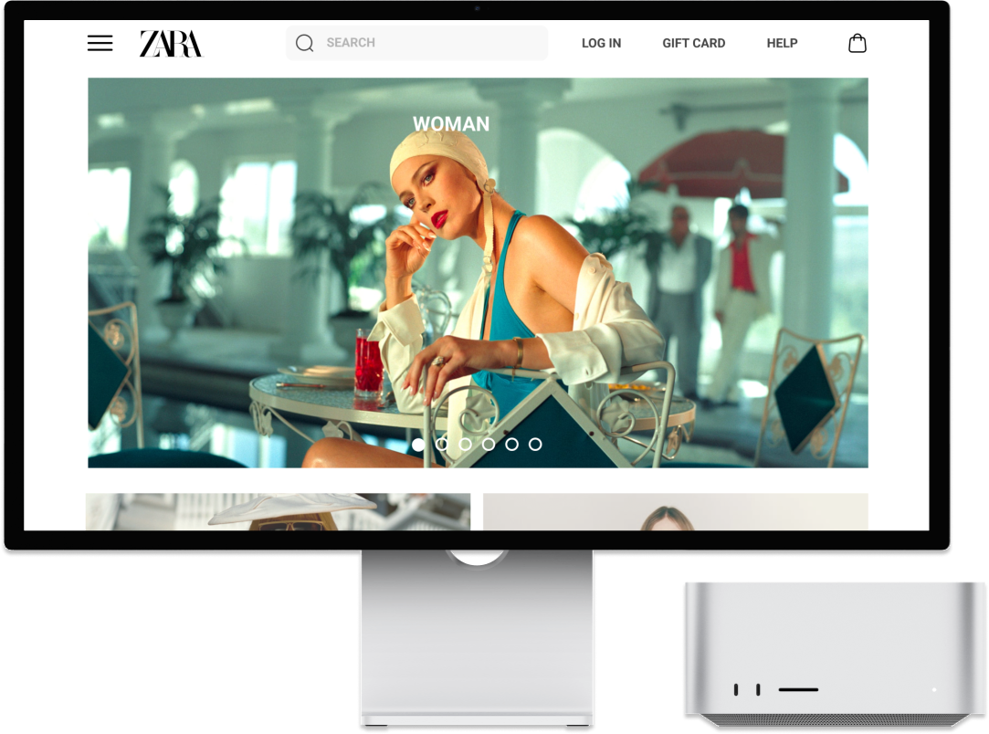
Zara’s e-commerce website was created to deliver the same elevated experience that customers get in brick-and-mortar stores. They hope that customers not only use the website for online shopping from the comfort of their homes, but also to provide them with a reference for inspiration through its editorial content.
Attractive business model
Zara's business model and success is not attributed to advertising as most of its energy is invested towards creating products for which they know demand exists.
Even on its e-commerce website, Zara often uses “quirky” pictures featuring models dressed unconventionally to create buzz around the brand.

Declining online traffic
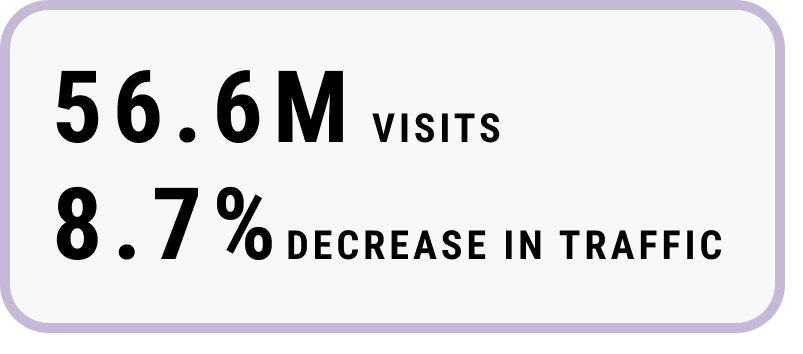
In the month of September, zara.com received 56.5 million user visits, which was comparatively lower than August. The traffic on the Zara website saw a decreasing trend of 8.7%, despite of its amazing range of collections, that it keeps on updating frequently.
57%
High bounce rate
What is Bounce rate?
Percentage of visitors who enter the site & then leave rather than continuing to view other pages
9%
Low Conversion Rate
What is Conversion rate?
Percentage of visitors that take a desired action, eg. completing a purchase.
Uncovering usability issues
Gauging how Zara affects users' moods
We conducted our primary research using Usability Tests and User Interviews to better understand how the users currently interact with the website and their current pain points. Observational usability tests and interviews enabled us to know the behavioral and attitudinal aspects from the user's point of view which gave us more insights.
Here are some of the findings.
Research Methods
Moderated Observation
User Interviews
16 Surveys + 7 interviews
We assigned three tasks to the users and recorded their behaviors while performing those tasks.
Outline of tasks
How did the users feel?
Hearing it from the users
- 65% users spent less than 12 minutes on the site when they visited.
- 75% users were unable to find the item they were looking for in under a minute.
Direct User Quotes:
“I don’t know which part is on sale in this big picture”
"If I want to shop from Zara, I'd rather go to the store than spent hours figuring out things on its website"
"It's hard to determine sometimes what Zara is trying to sell”
What were the key insights gained from the usability tests?
Interesting insights sprouted during user research
During the usability testing, most of the users felt lost and wanted to give up at certain instances, mainly due to;
IMPROPER NAVIGATION
Use of jargon
OVERWHELMING DISPLAYS
INCONVENIENT CART CHECKOUT
NO SORTING FUNCTIONALITY
LACK OF PROPER NUDGES
Poor legibility
- Distracting photography and videography
- Low contrast of text vs background image
Wordy categorization
- No broad categories (tops, bottoms,
outerwear, etc.)
Misleading product images
Lack of nudges
- The view change option in the form of a bar isn’t easy to understand or use.
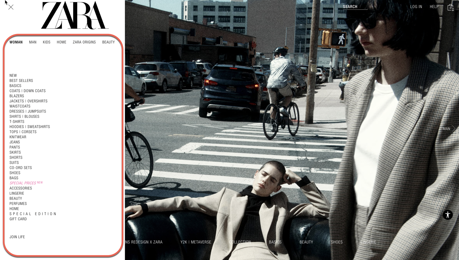
Unclear navigation
- No indication where second and third-tier organization exists (drop-down menus).
Inconsistent footer
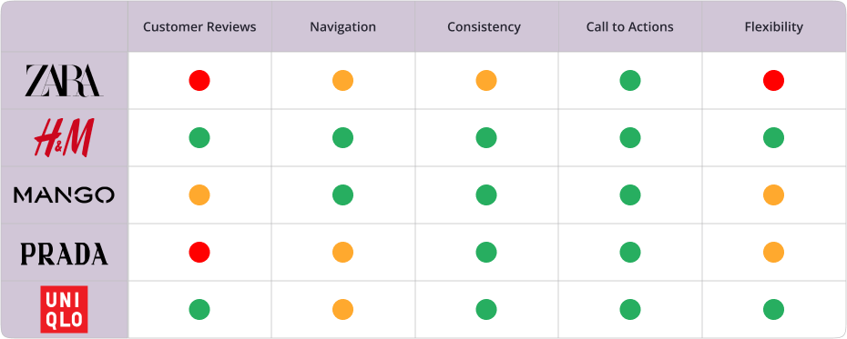
How are the competitors doing?
Breaking down the good and the bad
I dissected Zara's digital landscape alongside its competitors, unraveling a nuanced analysis. Delve into the details with me as I chart out a roadmap of strengths and weaknesses, laying the foundation for a bespoke Zara website redesign.
How did we predict our user flows?
Discovering how people categorize information
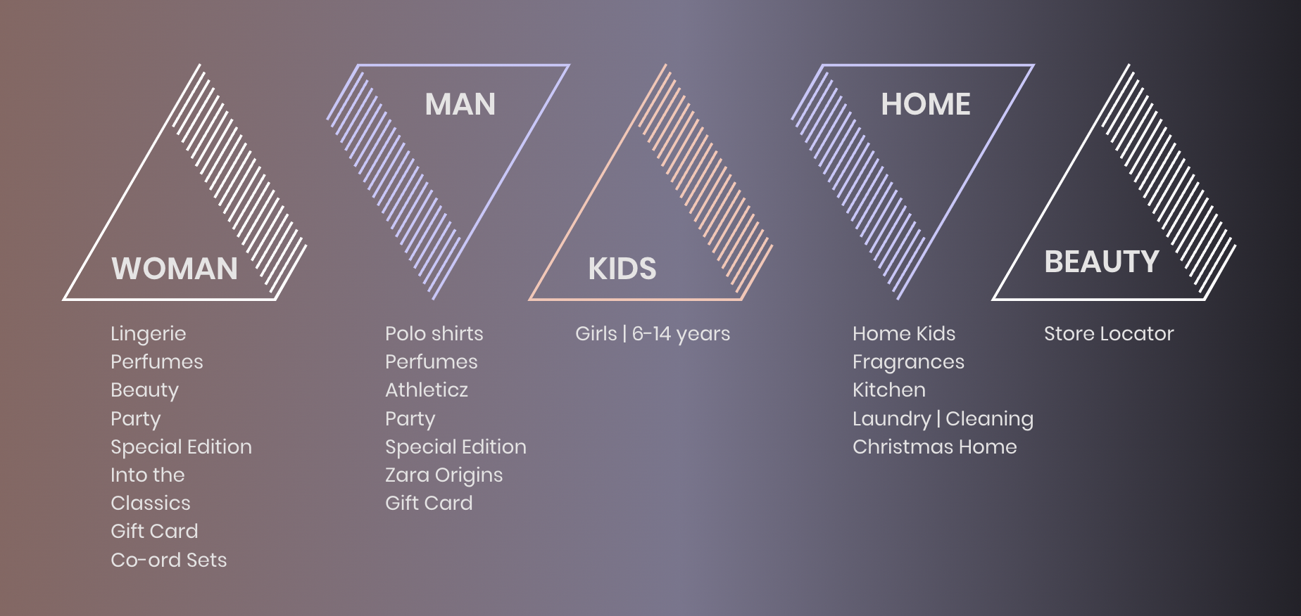
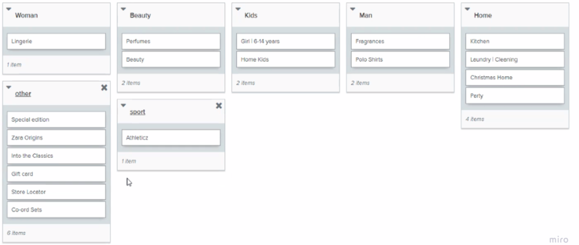
In order to find out how Zara's customers would expect to see the information grouped on its website, we conducted Card Sorting technique using Optimal Workshop software. We performed Hybrid Card Sort where participants could sort cards into the given categories and even create their own categories.
6 volunteers | Hybrid Card Sorting
Cards used in the study under their original categories:
Let's see how the participants categorized these cards:
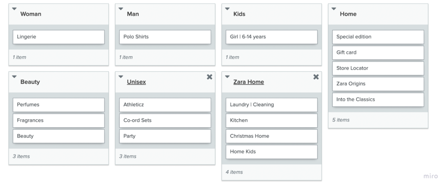
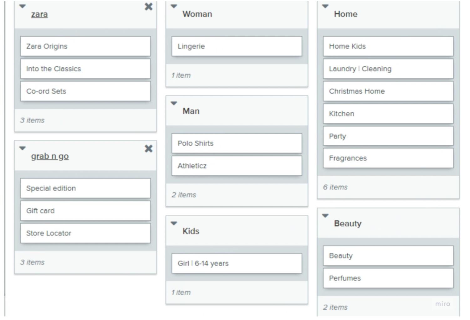
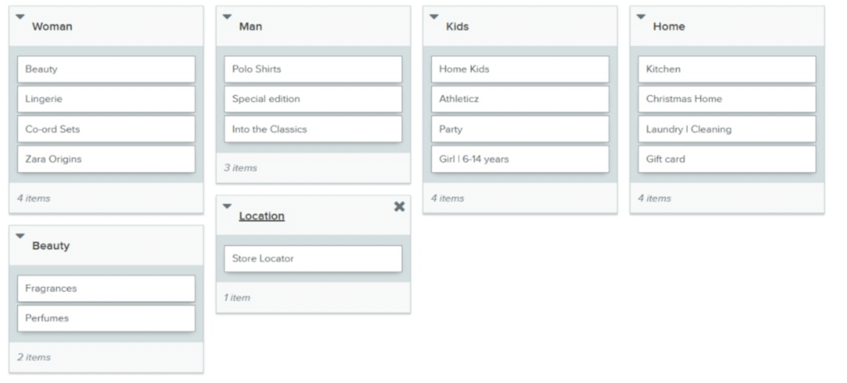
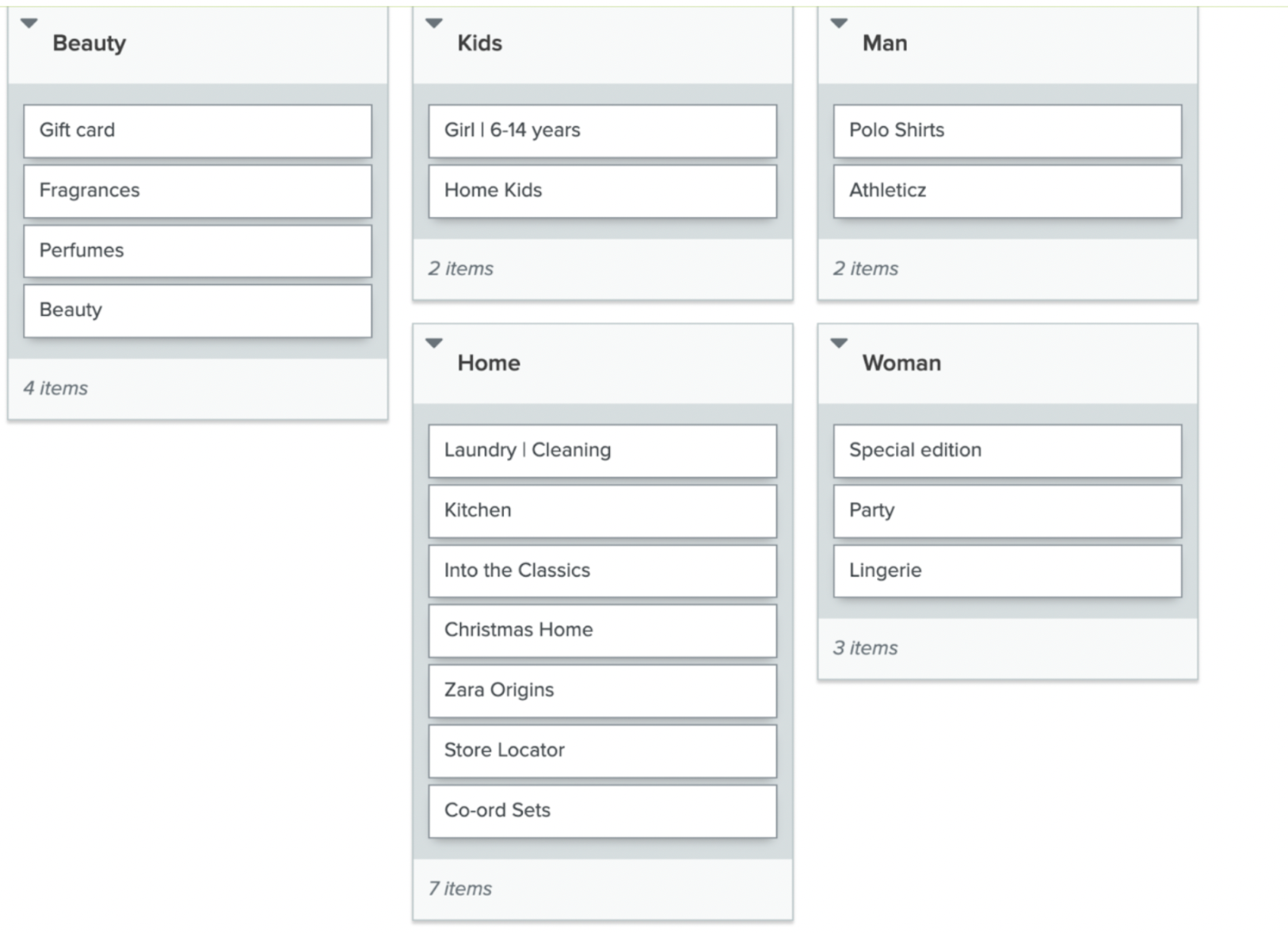
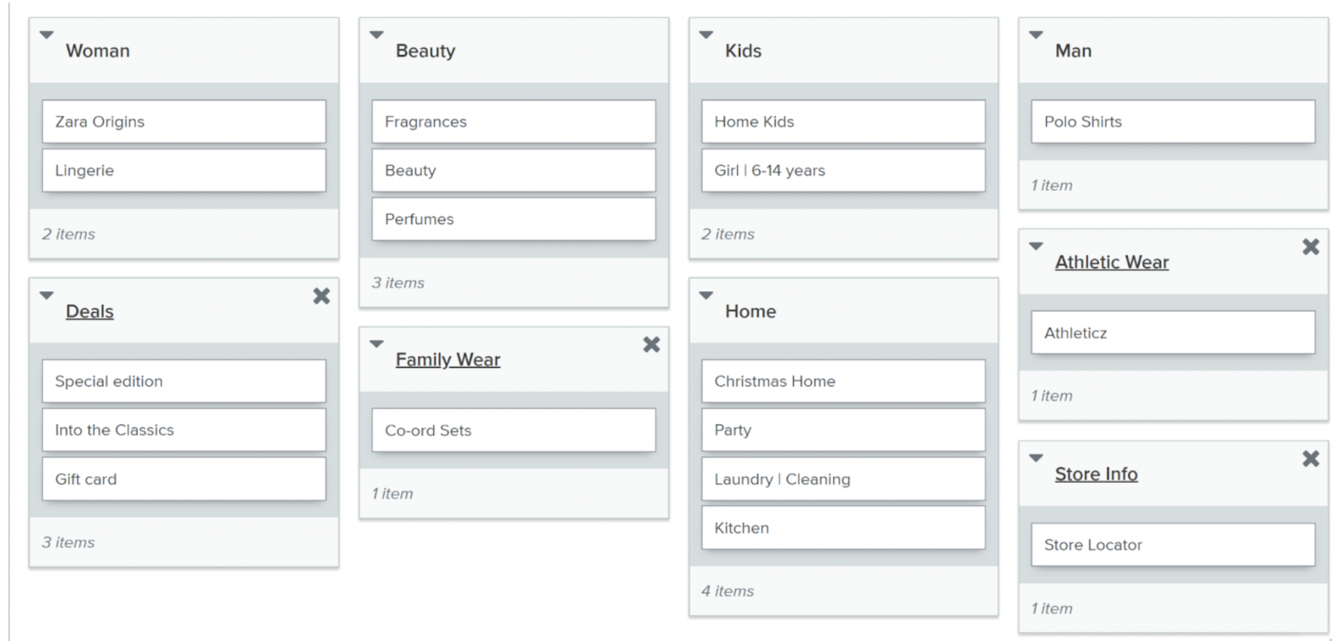
Card Sorting Key Takeaways
Agreement with zara
Lingerie
Christmas Home
Disagreement with zara
Home Kids
Gift Card
COMPLETE CONFUSION
Athleticz
Zara Origins
Into the Classics
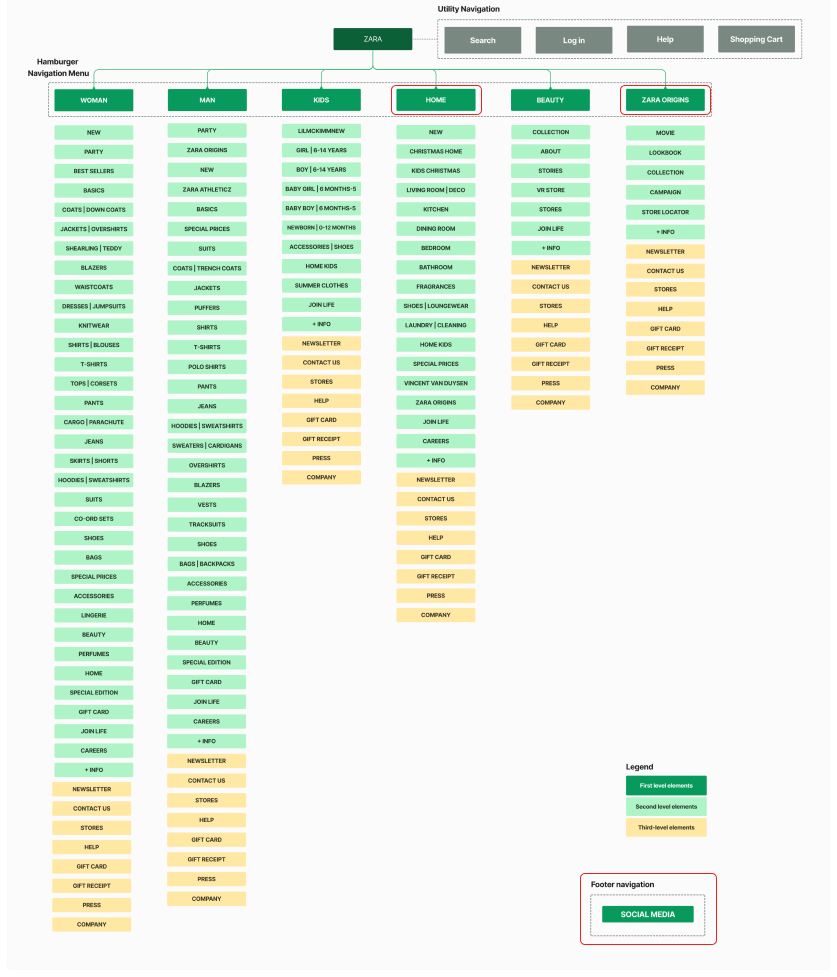
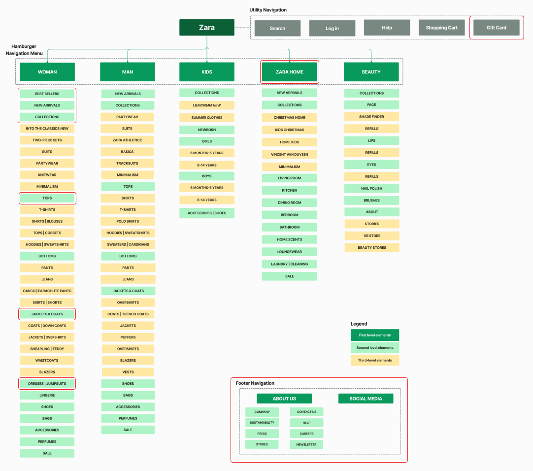
IA Schematics
IA Schematic Diagrams before and after Card Sorting
tests
Tree Testing to determine labelling and content organization
Discovering how easily and quickly people find information
In order to find out if the labels made sense to the users, and if the content was grouped logically, Tree testing was conducted using Tree Jack. With the aim to figure out what was stopping users to find the information they want with ease, we set out 5 tasks with 20 participants.
5 tasks | 20 participants
We assigned five tasks to the users and recorded their paths towards completion of those tasks.
Outline of tasks
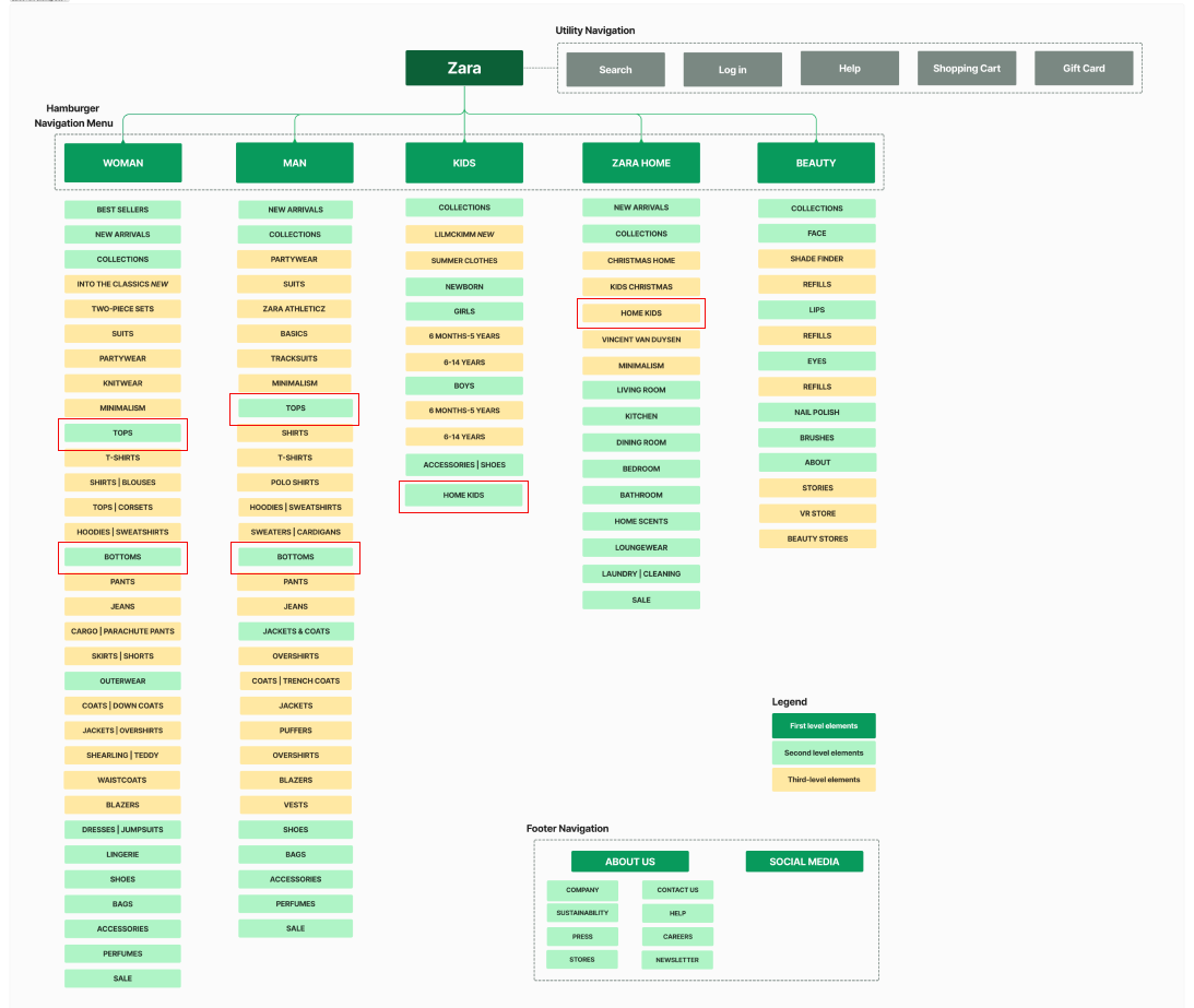
IA Schematic Diagram
Final IA Schematic Diagram after Tree Testing
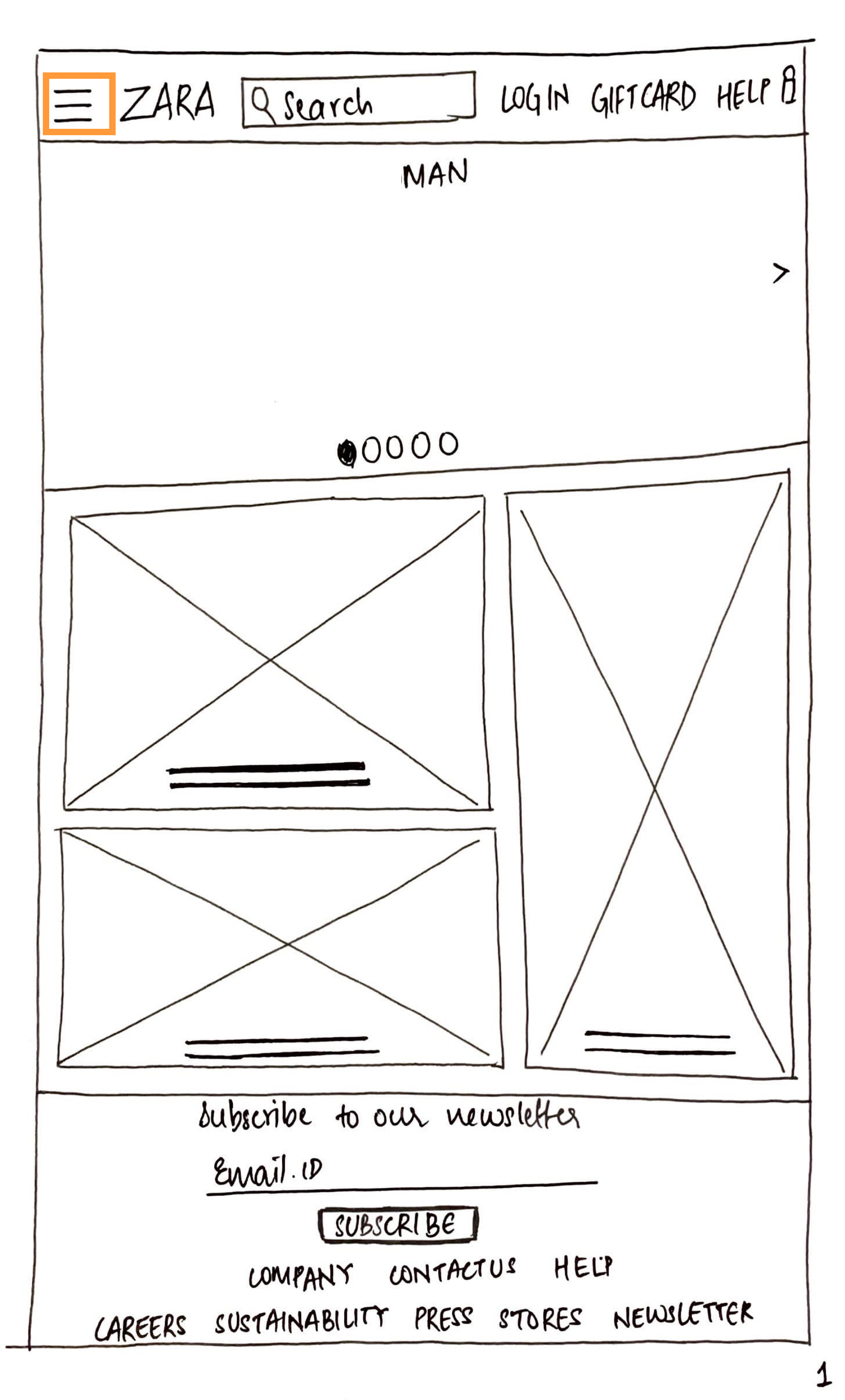
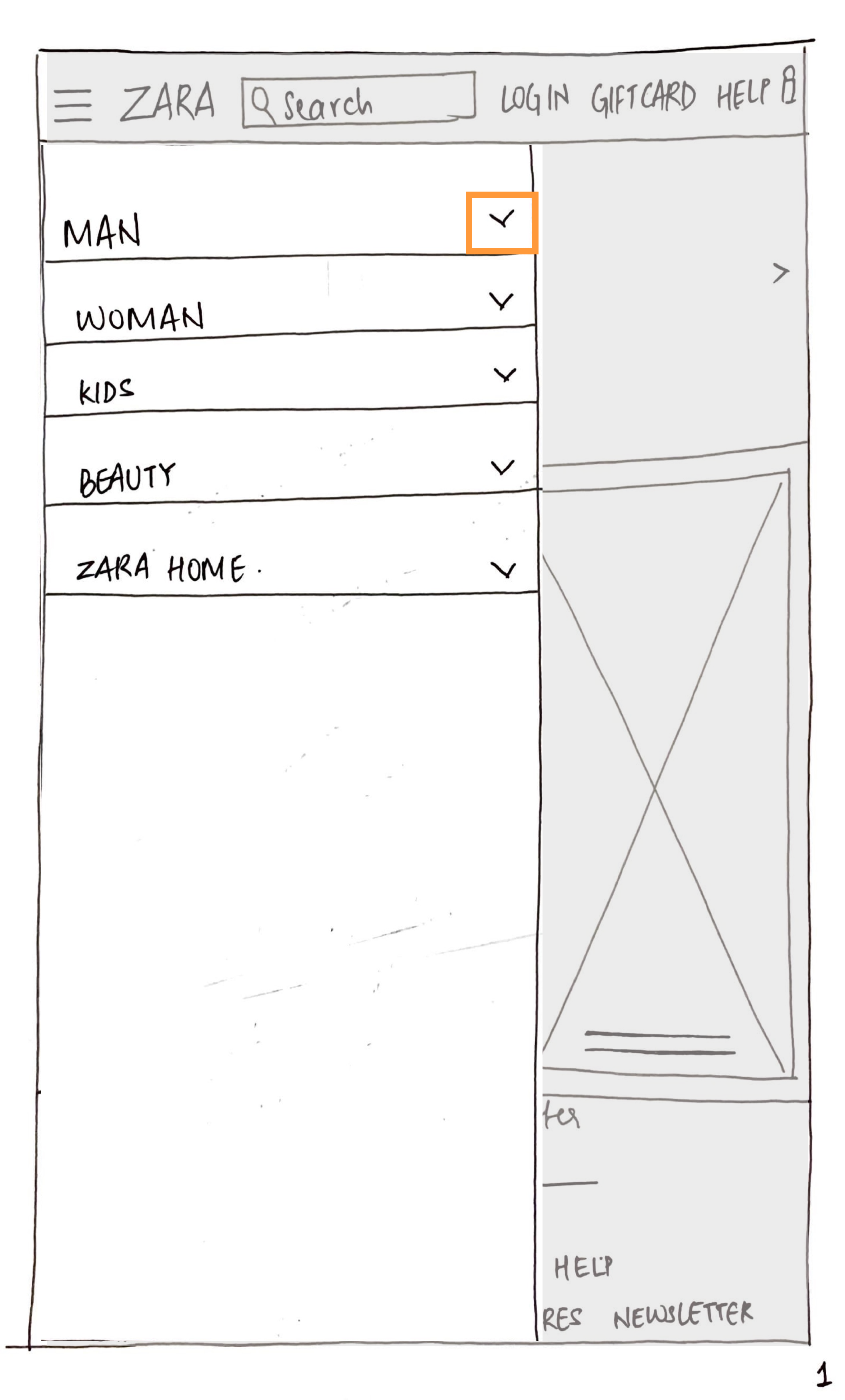
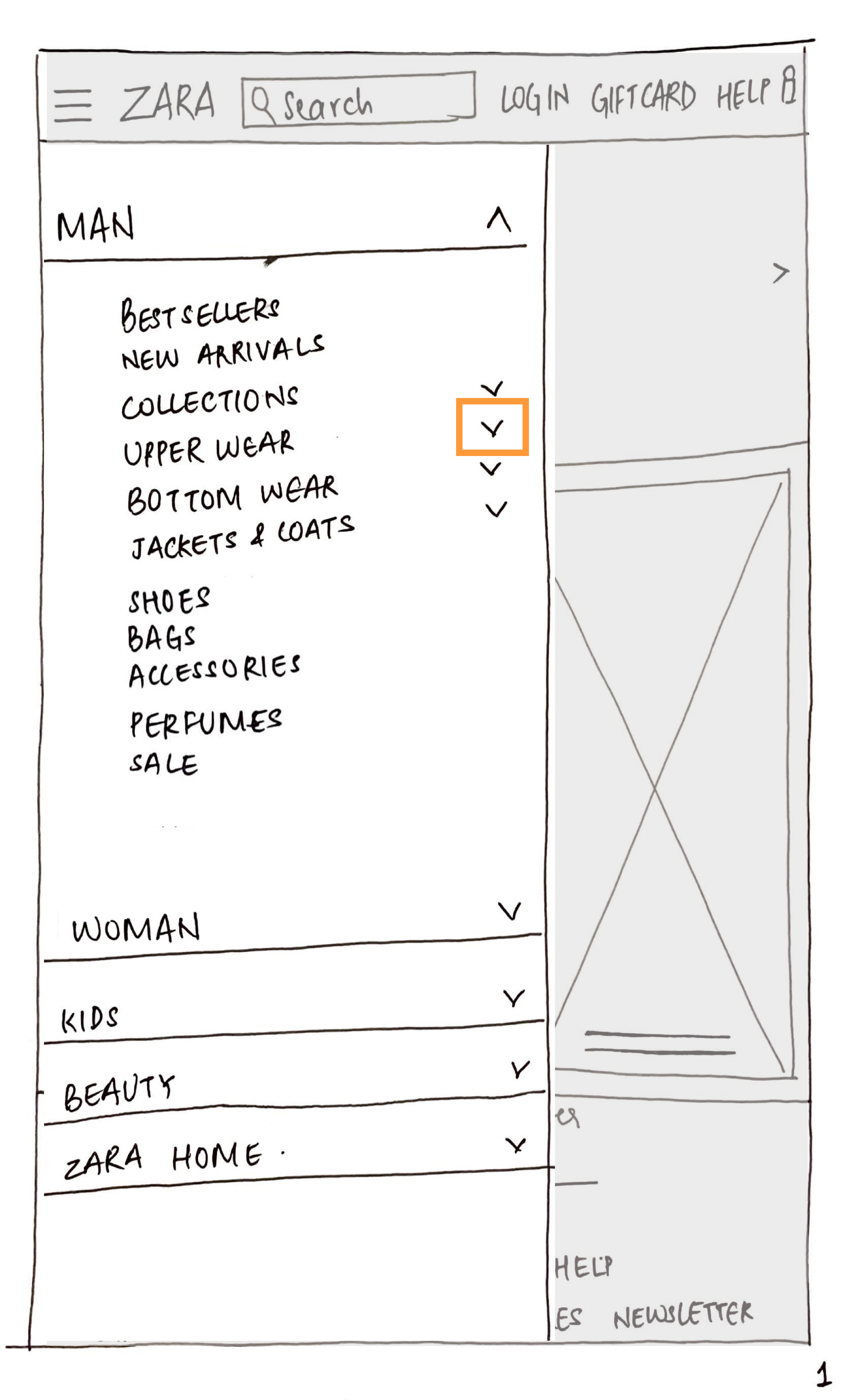
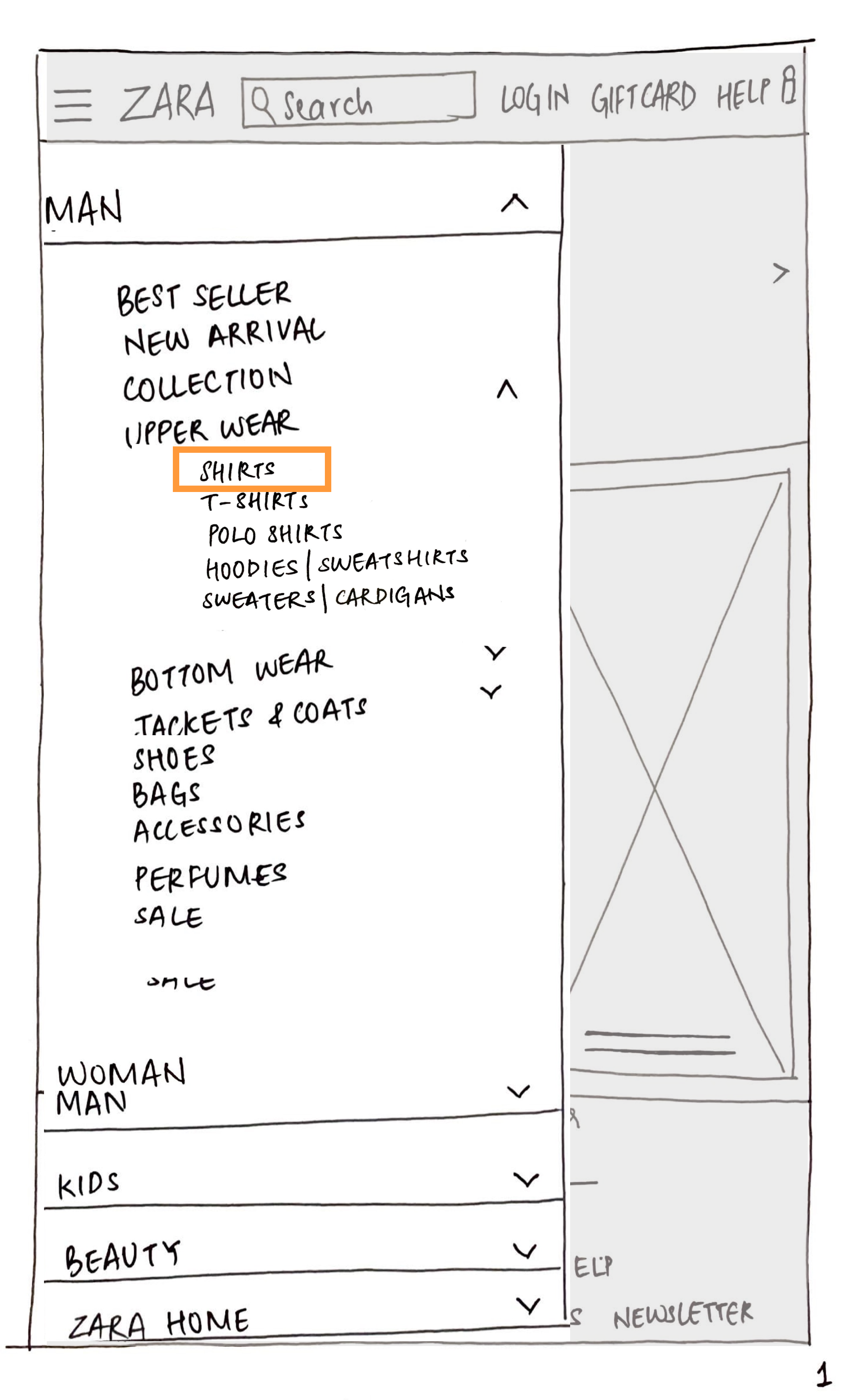
Low fidelity Wireframes
Paper Prototyping
How did the studies affect our design decisions?
New Design Decisions
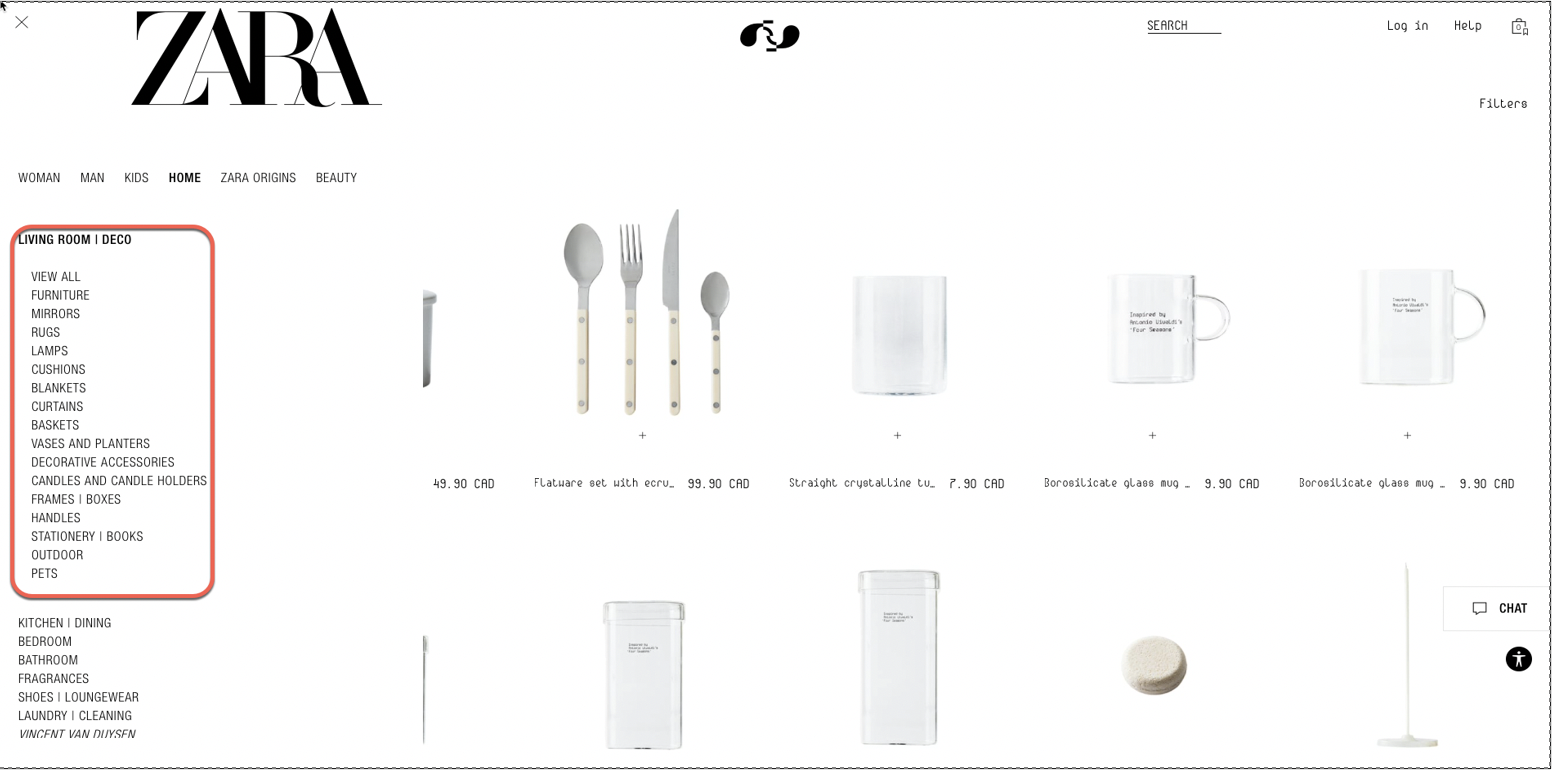
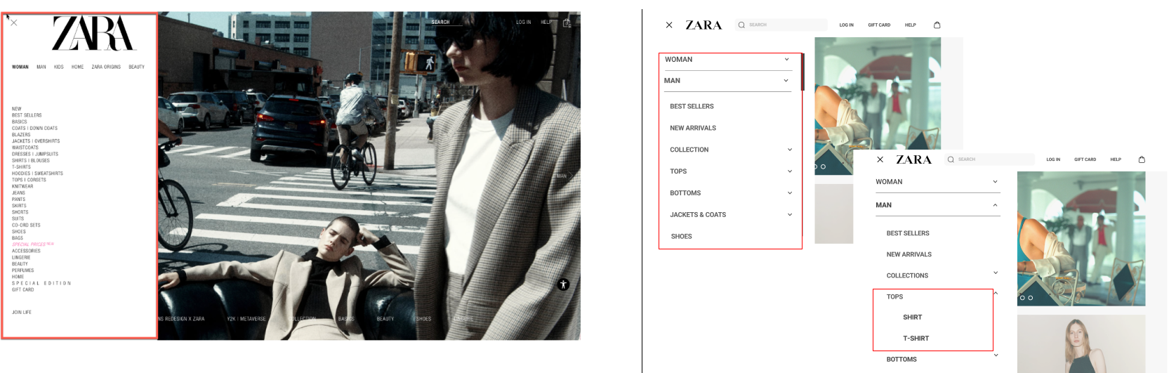
NAVIGATION SYSTEM
- Better use the fat footer
- Move subcategories to the utilitity navigation bar and fat footer
ORGANIZATION SYSTEM
- Reduce categories & subcategories
- Three-click rule
LABELLING SYSTEM
- Rename ambiguous/vague labels
- Use of card sorting feedback & direct competitors websites
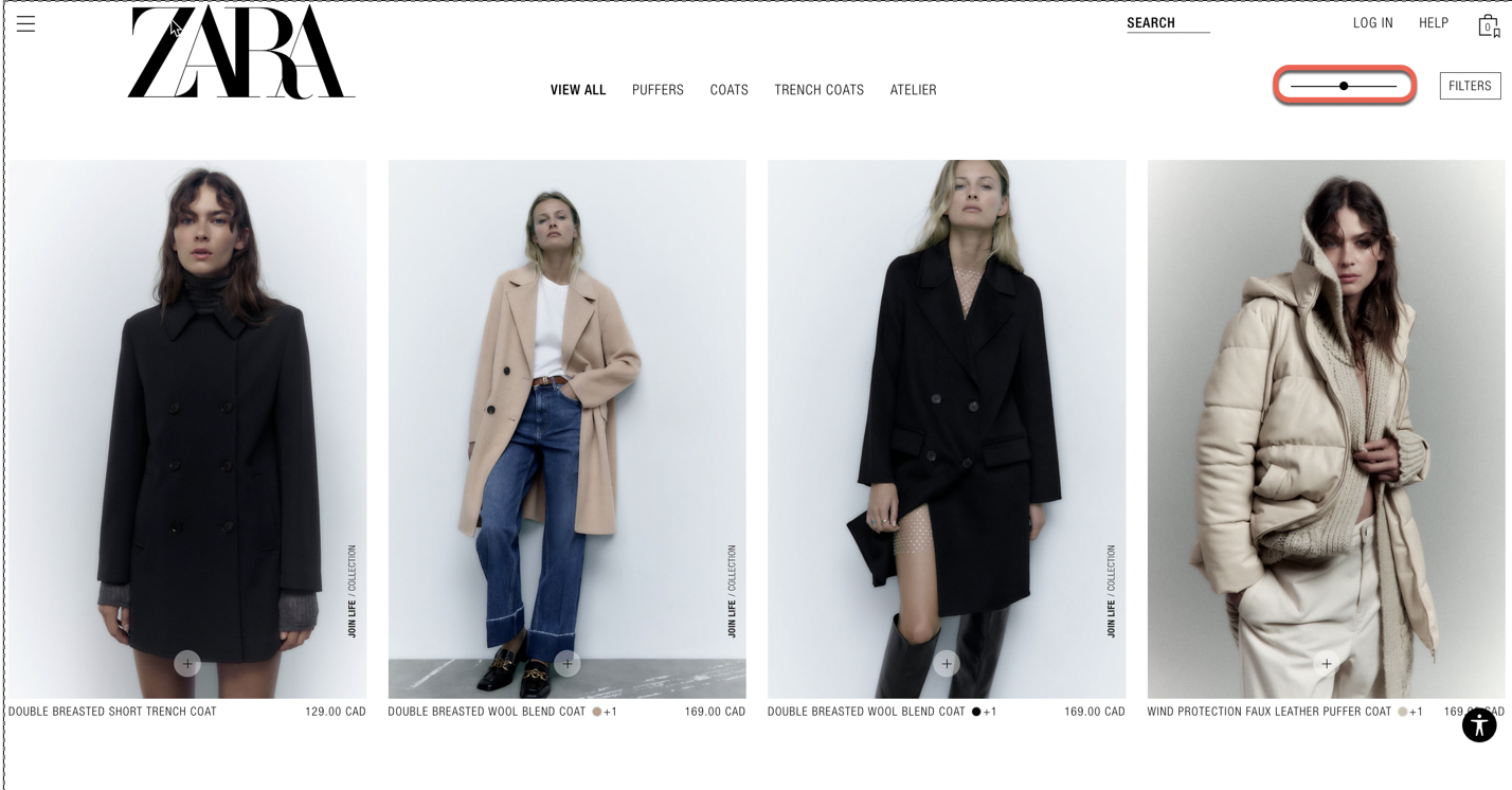
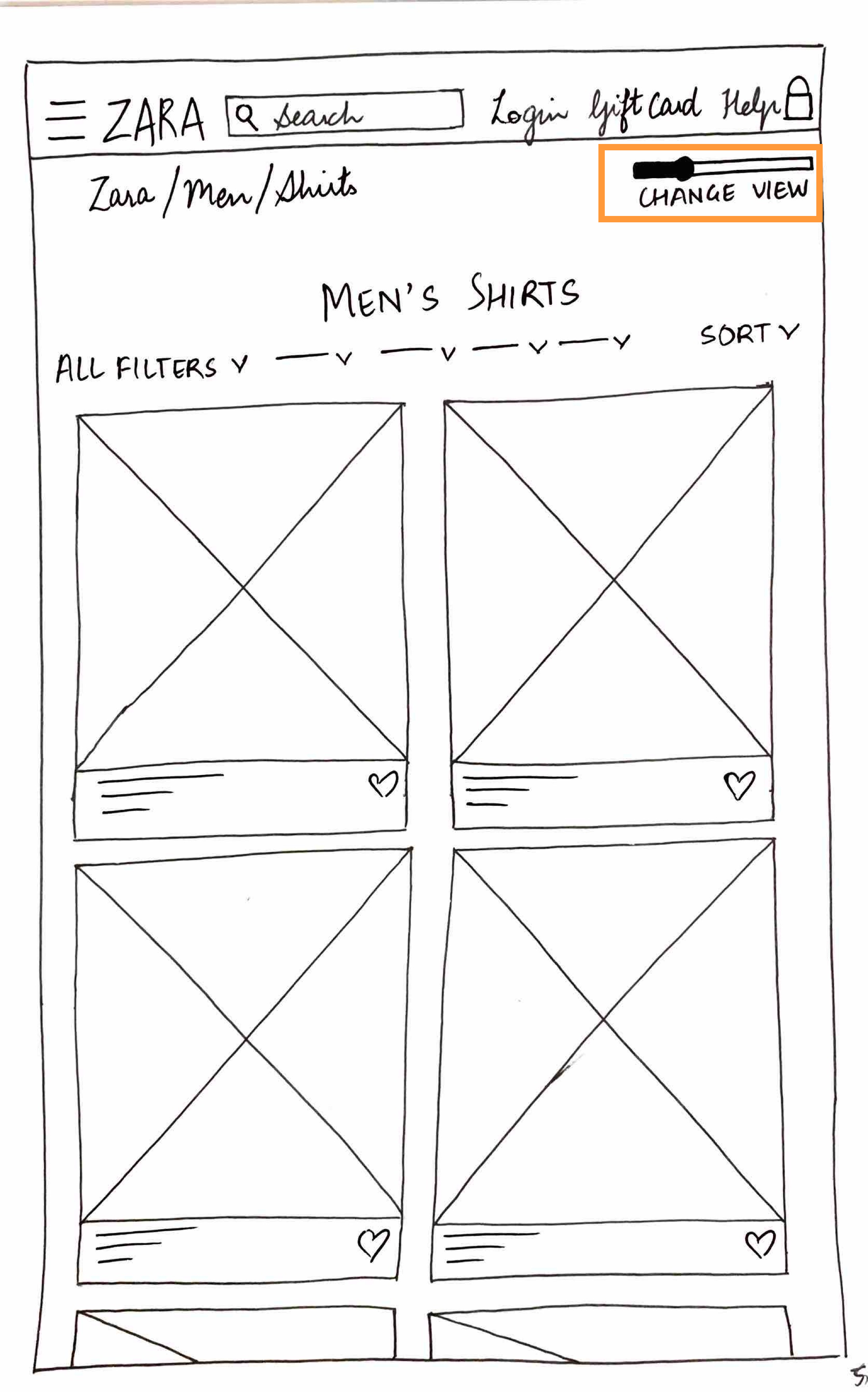
High fidelity wireframes
Hi-Fi Prototyping
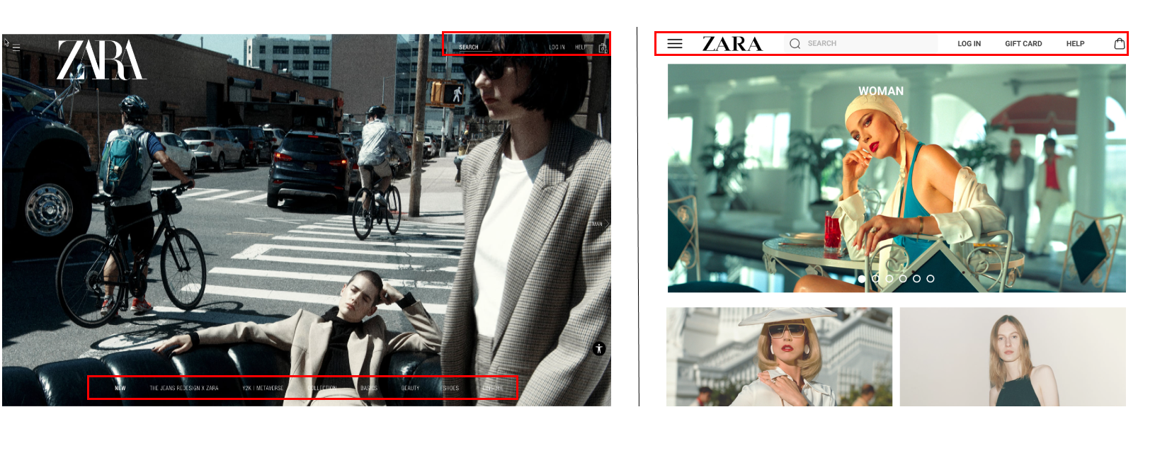
-poster-00001.jpg)
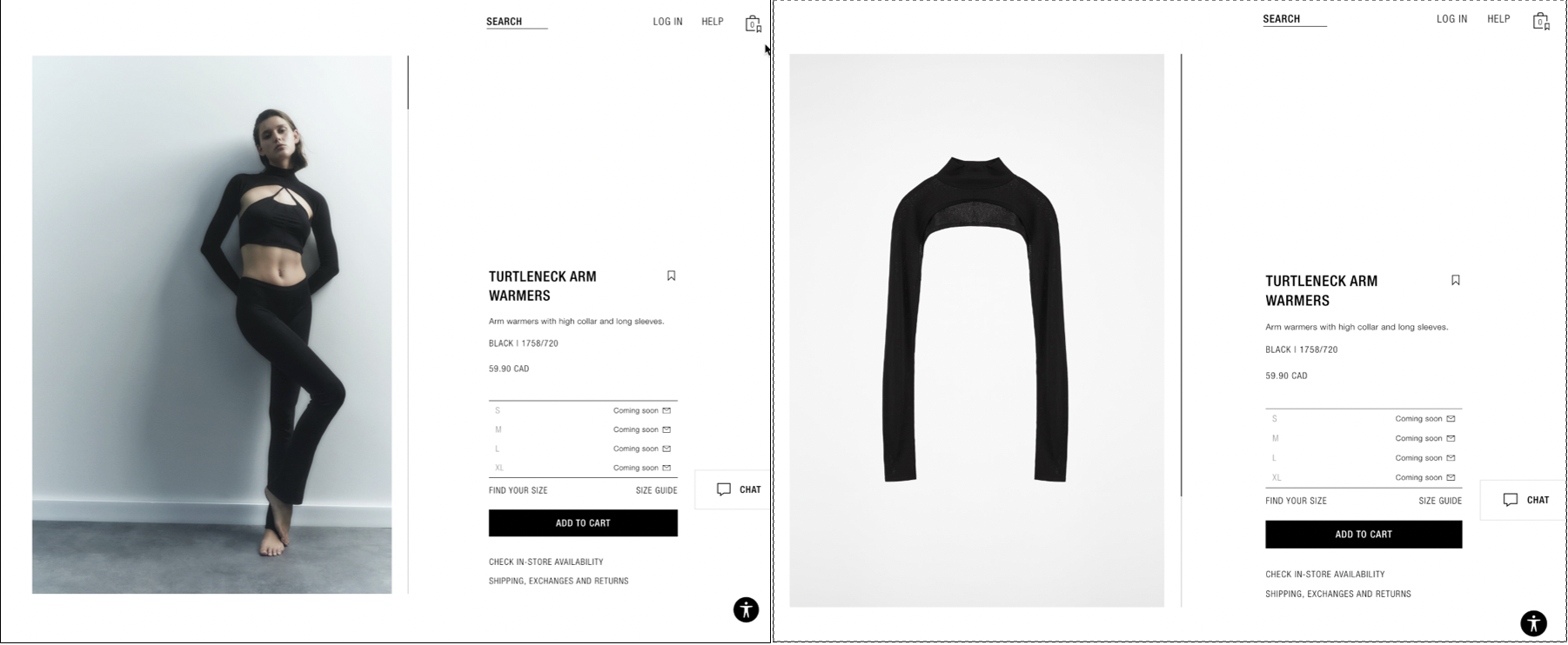
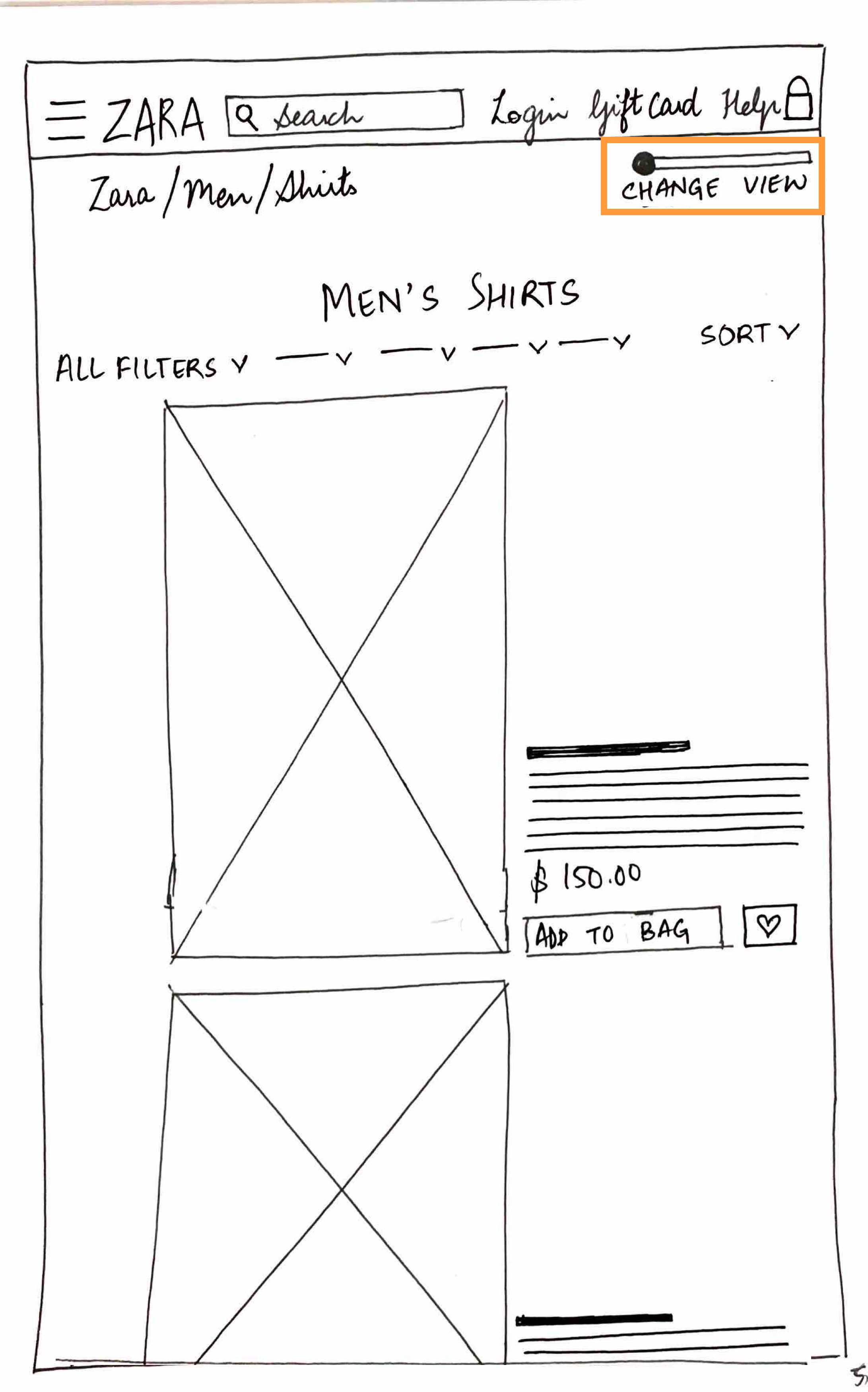
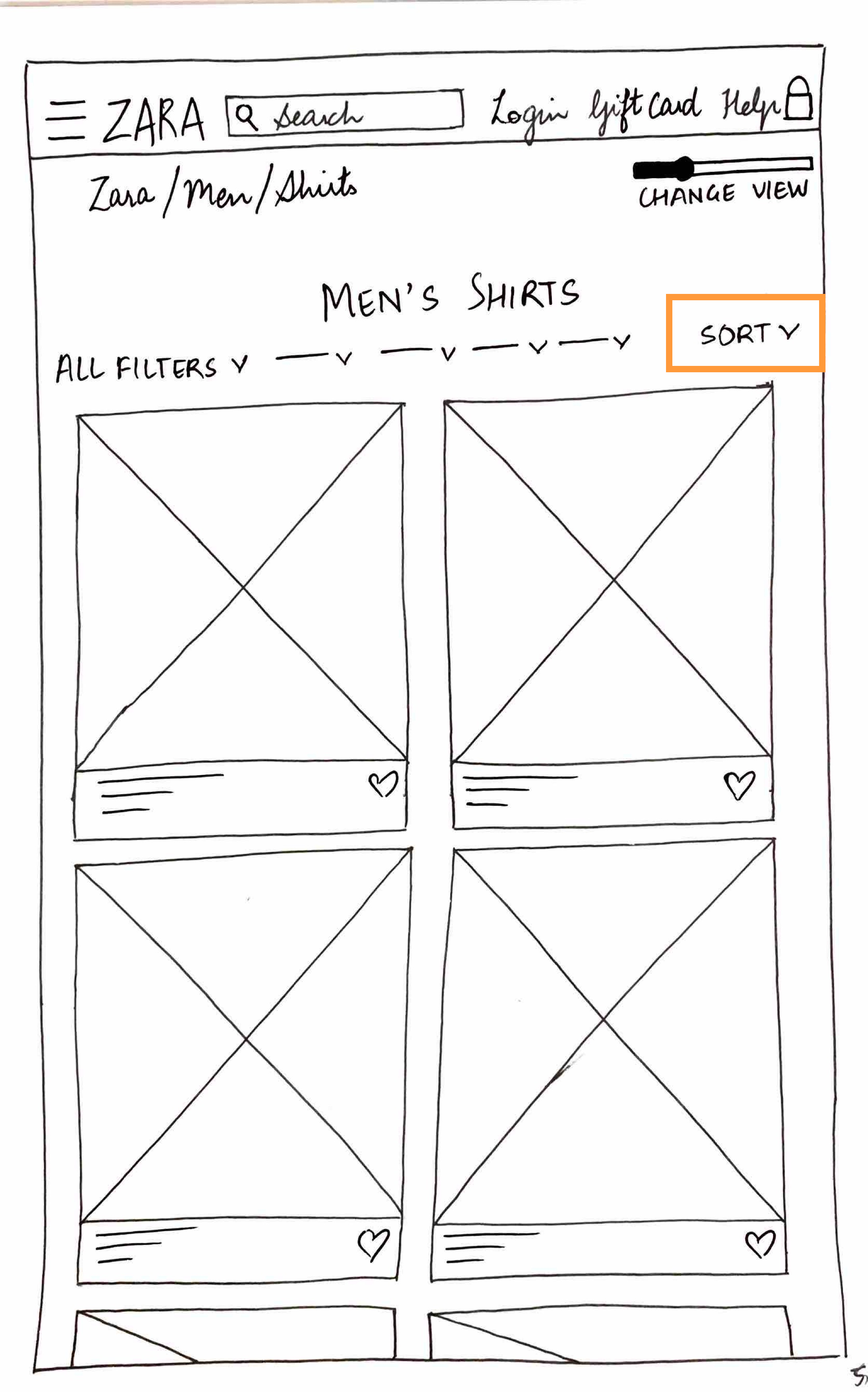
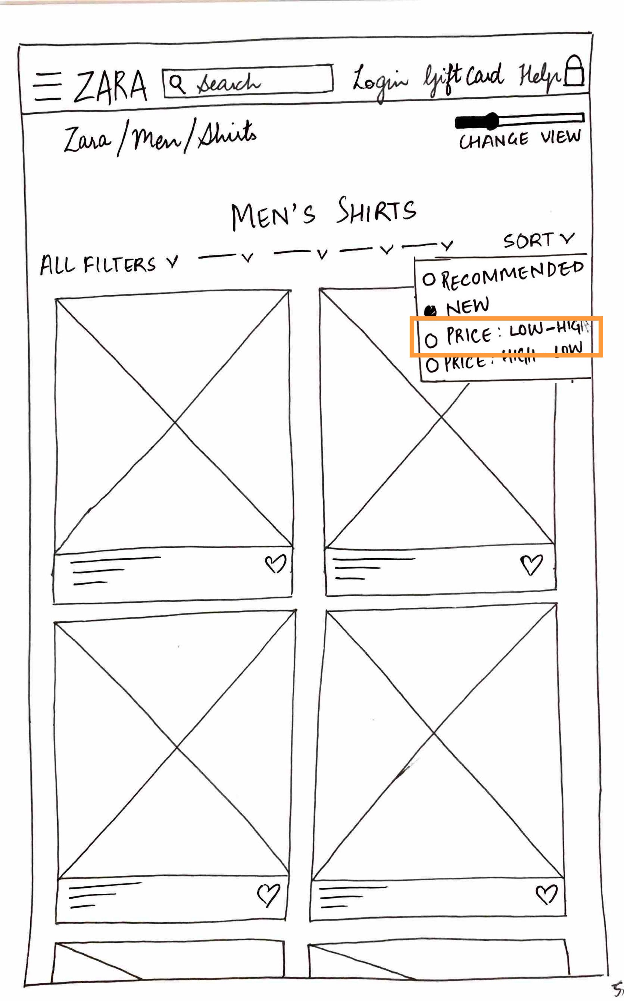
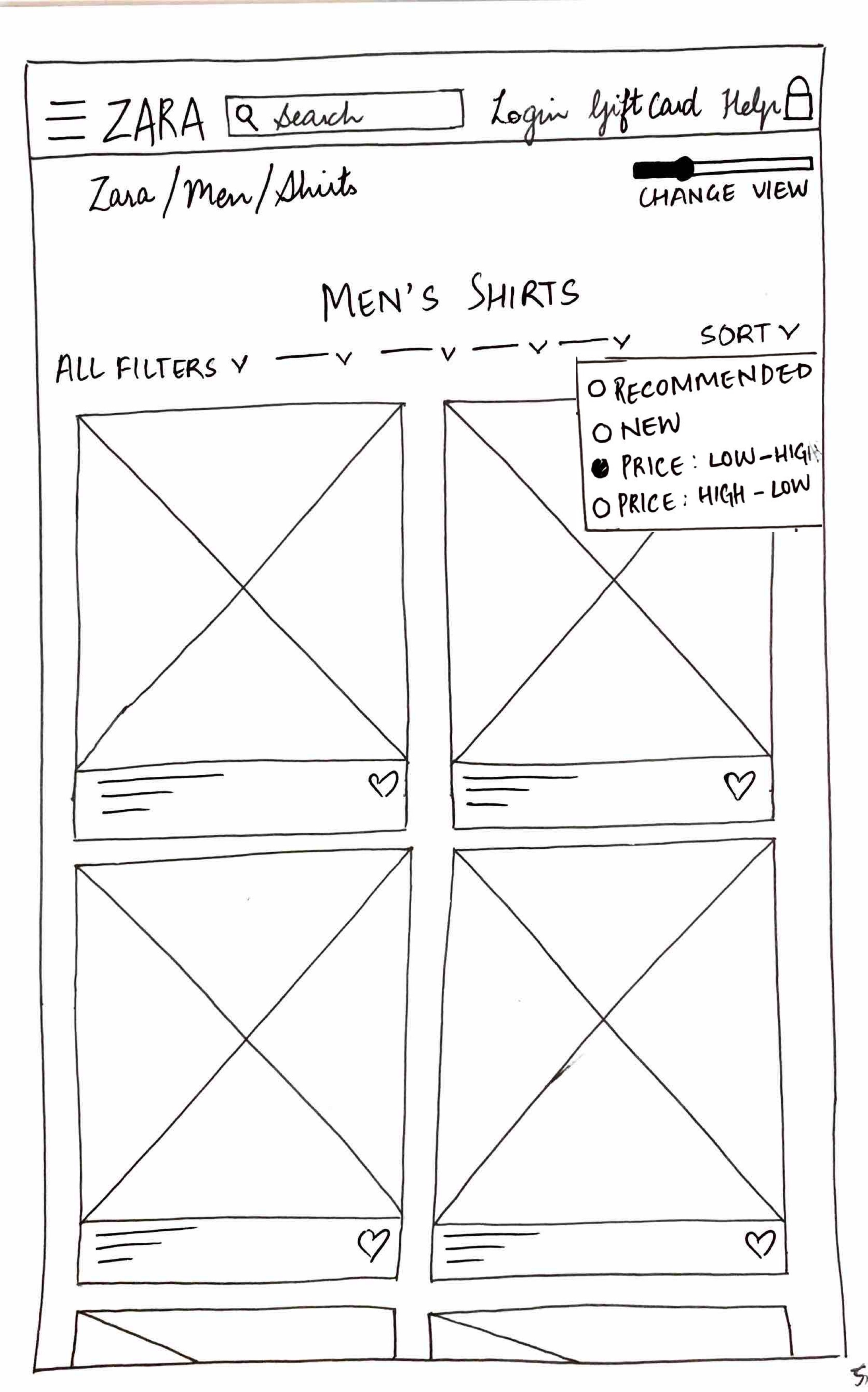
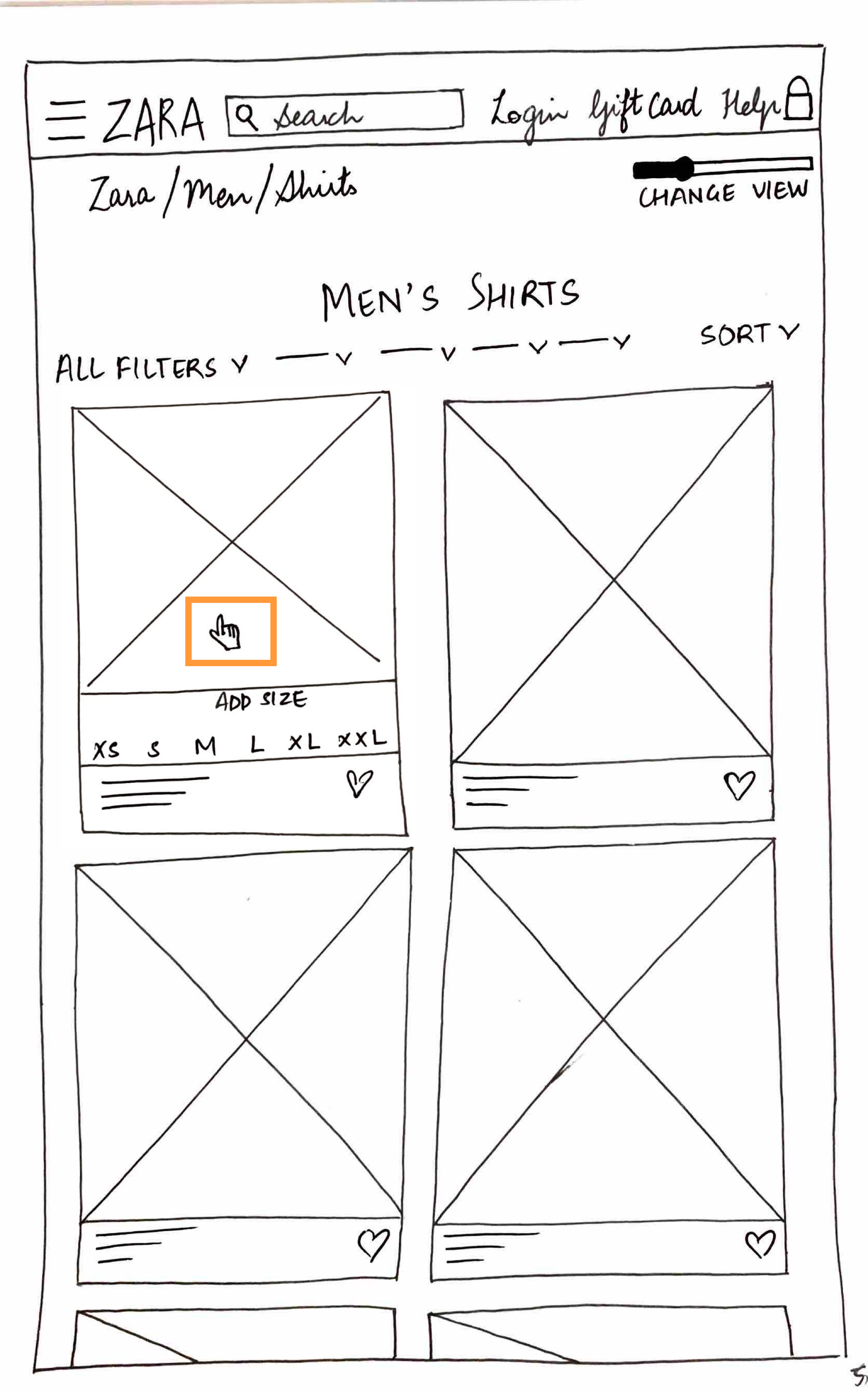
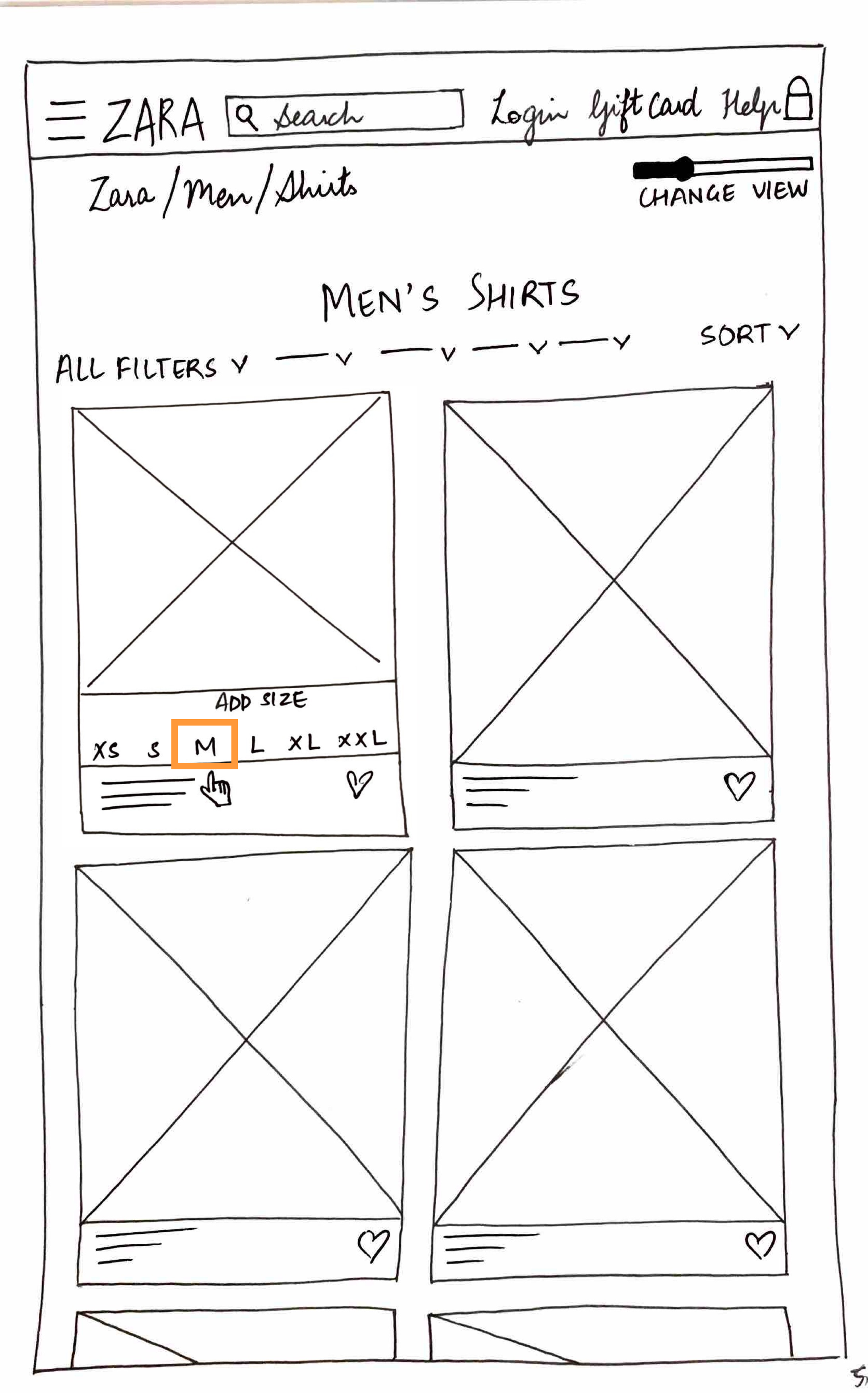
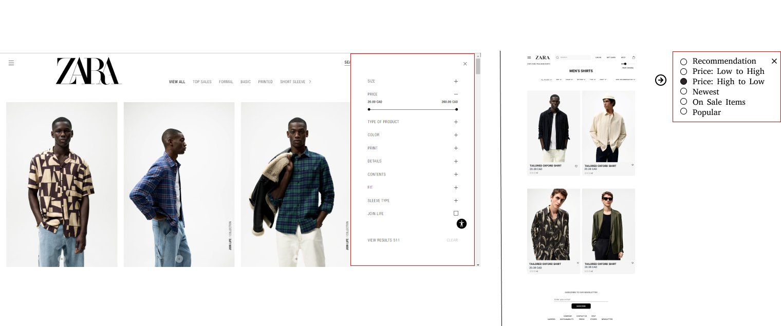
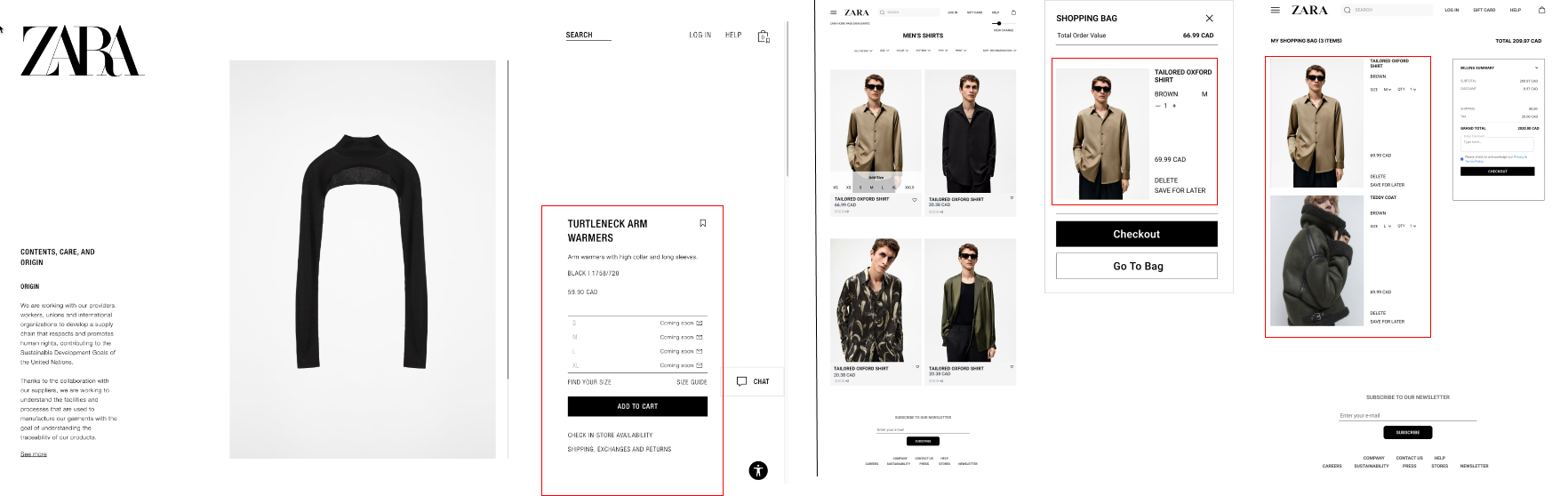
- A well-labelled "View Change" option
- "Special Prices" -> "Sale"
-poster-00001.jpg)
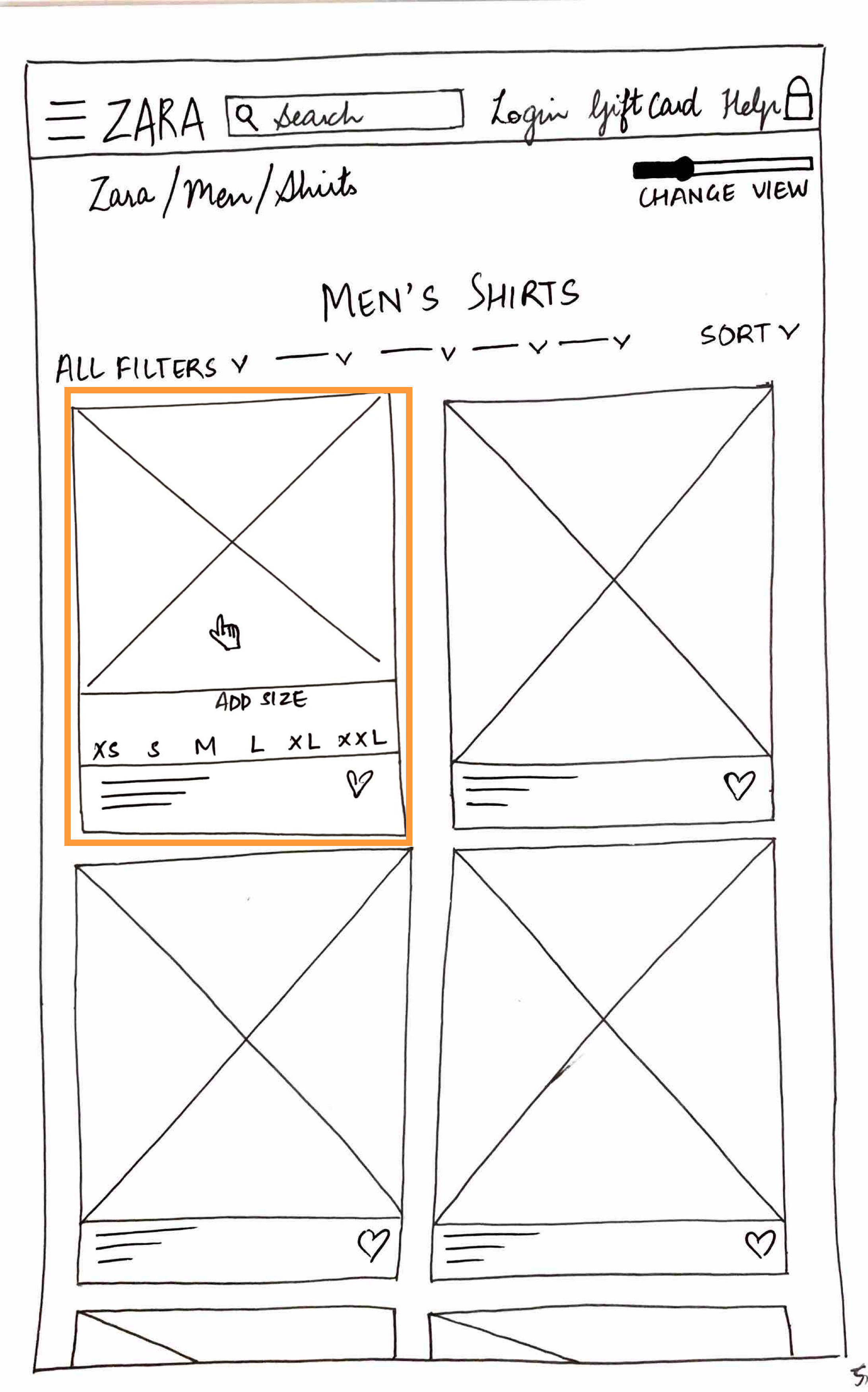
- Horizontal Filter Options Layout
- Size Hover Option
- Fresh Sorting Functionality

- Breadcrumbs
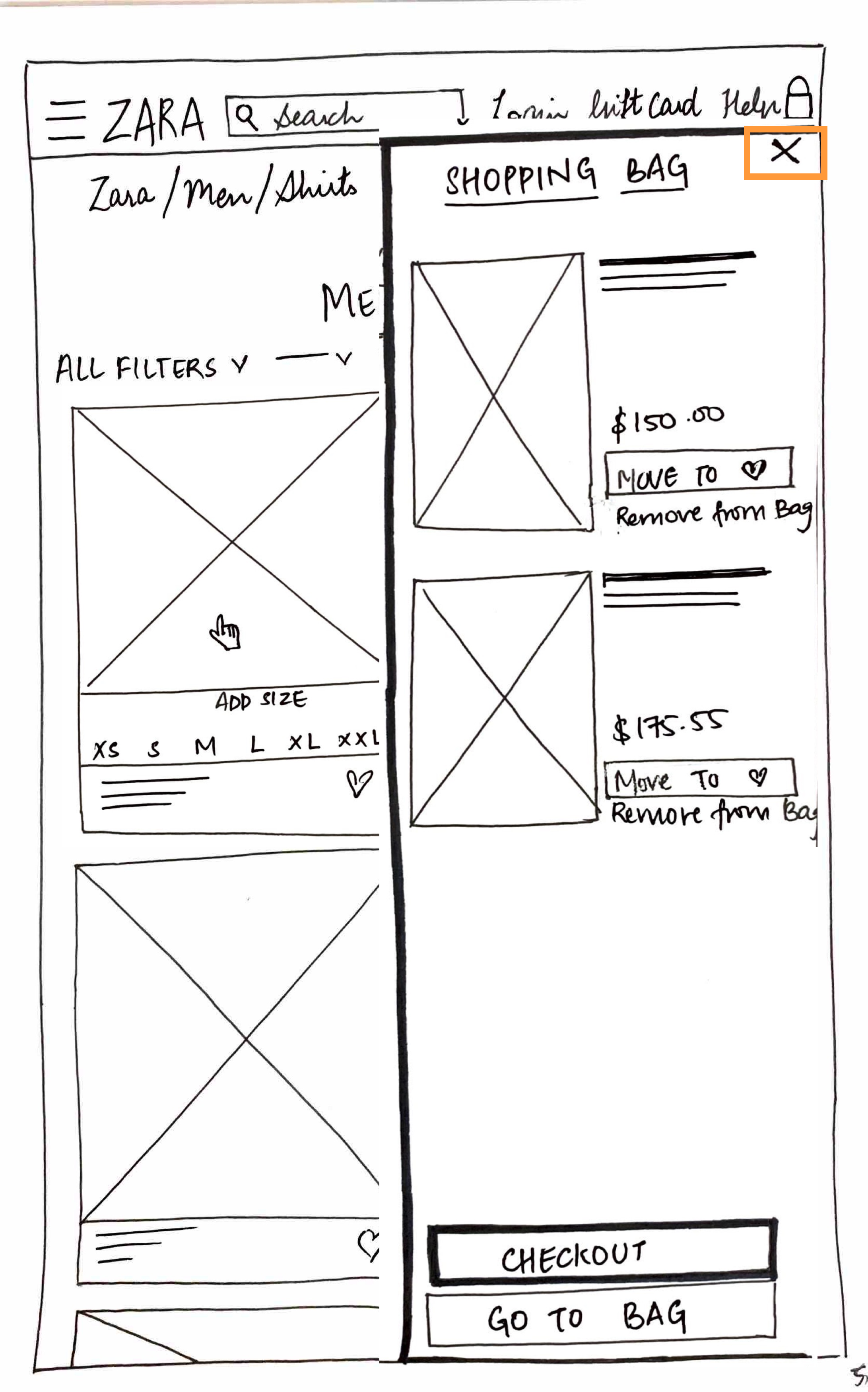
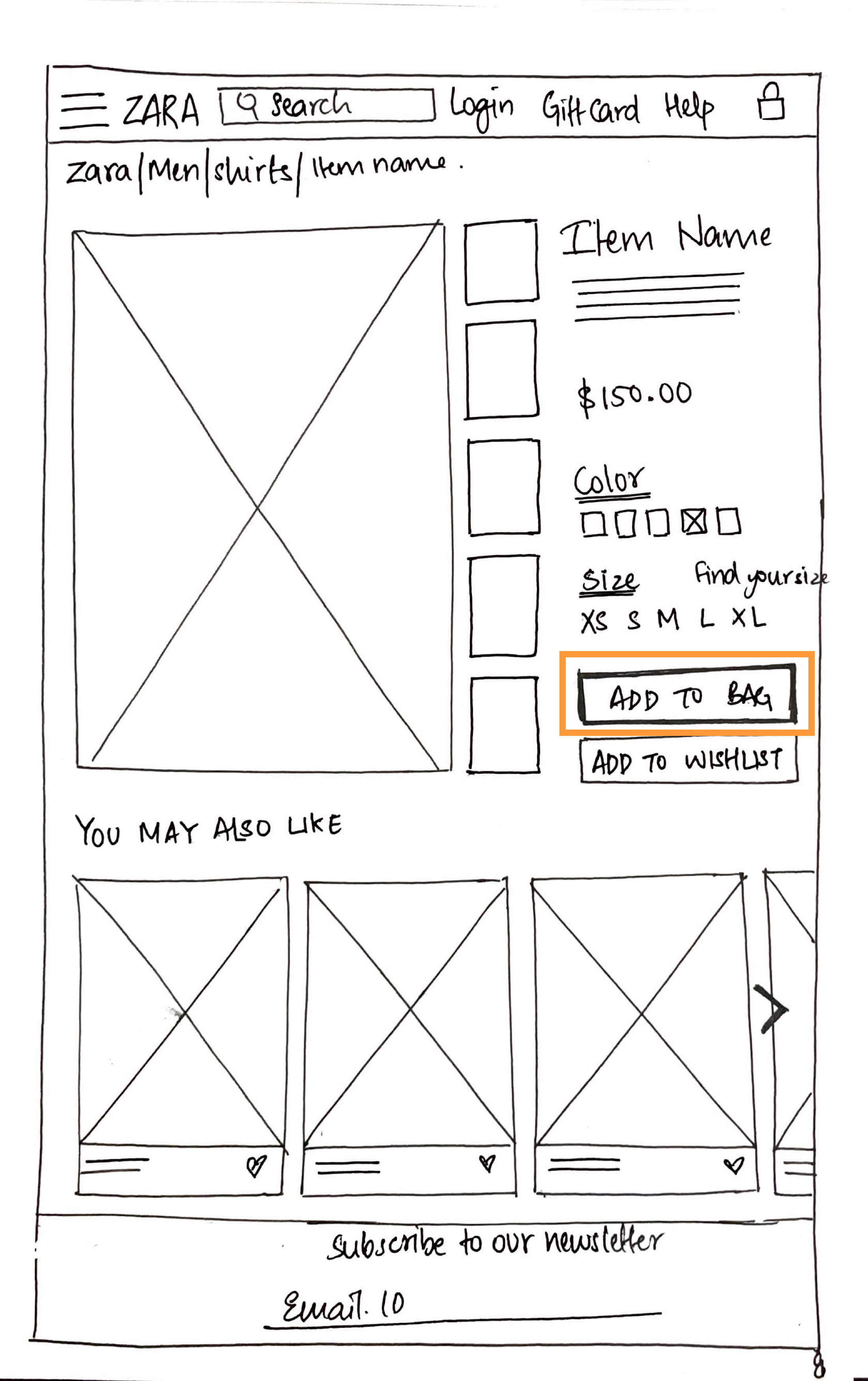
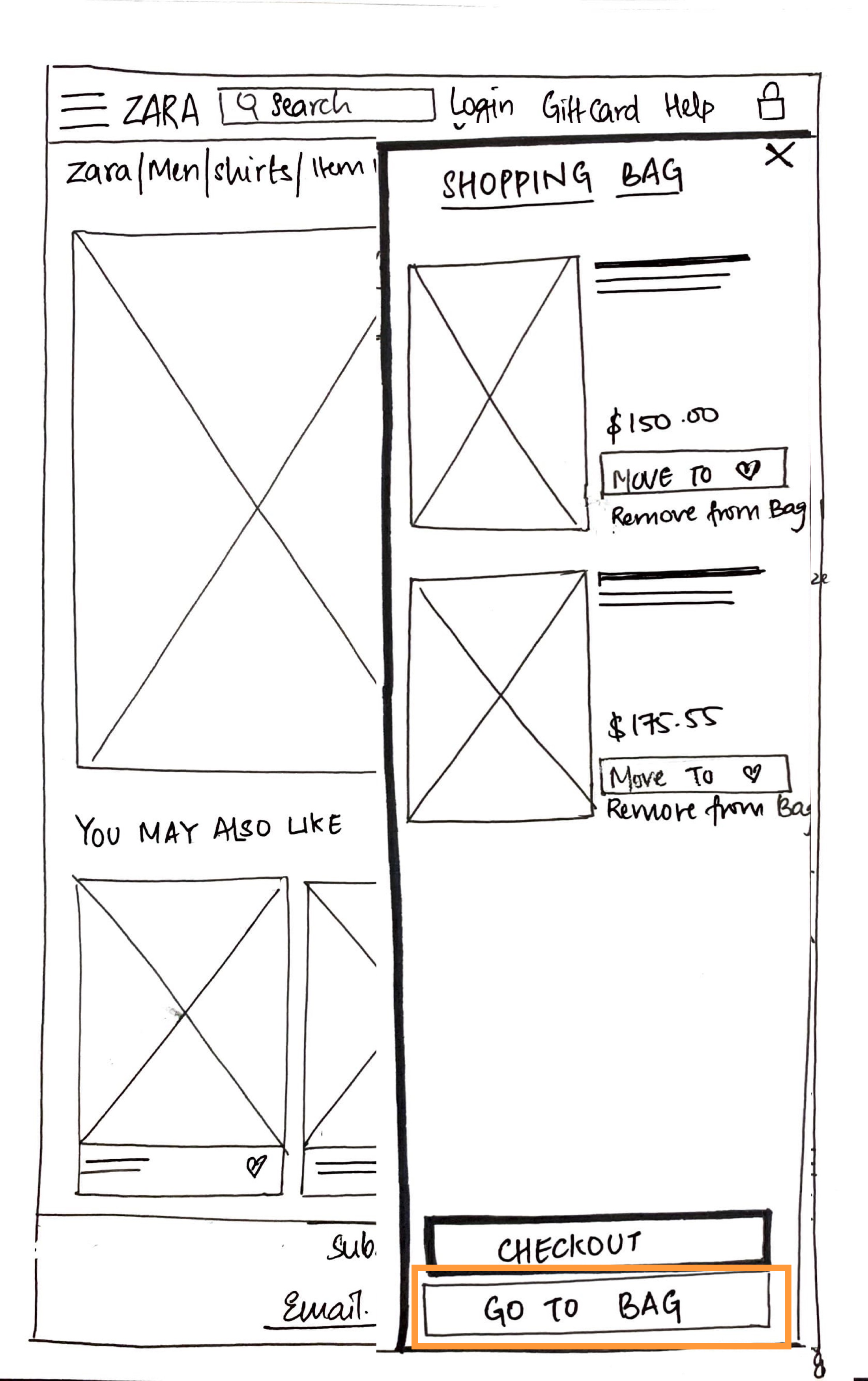
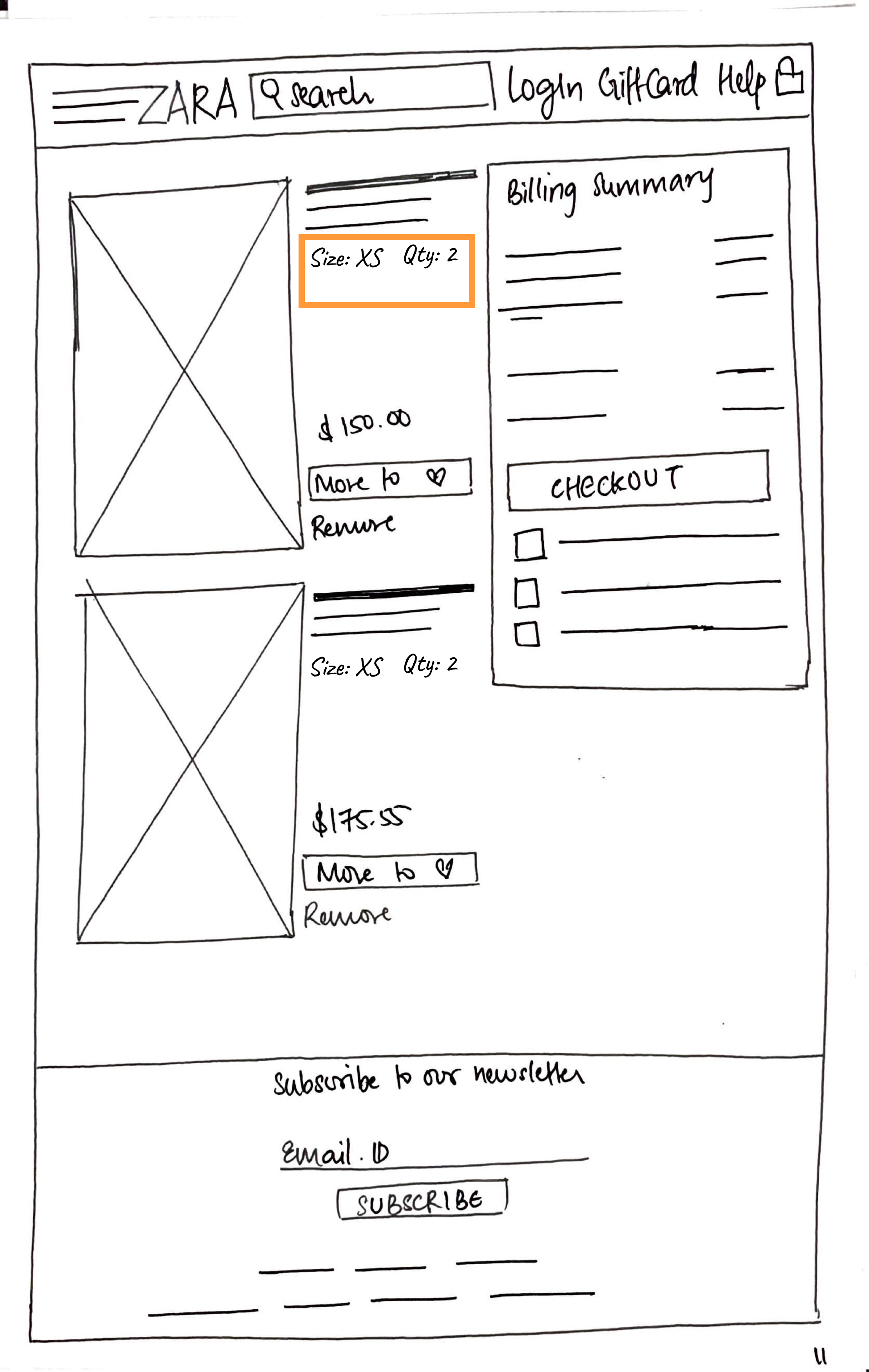
- Ability to edit Cart items
What did we change in the website?
What's new?
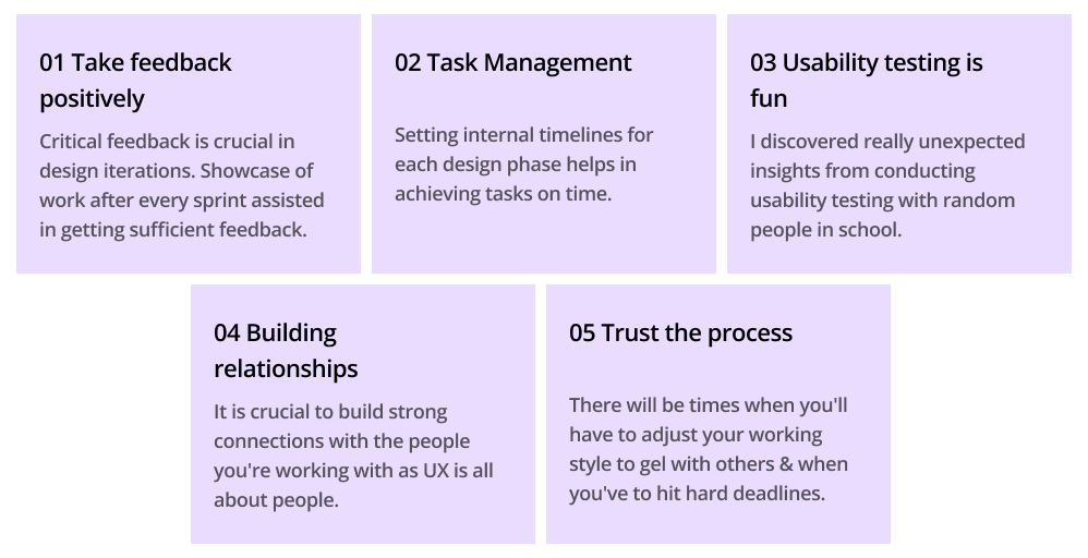
What did I learn throughout the process?
Reflecting on the project outcomes
"Good design is about process, not product."
This quote by Jared Sinclair inspires me to follow the design process religiously.
Working on a website like Zara was pretty challenging. It requires a lot of patience and team work to come up with loopholes in a brand's website that is doing so well but lacking a good online user experience. While doing the background research for Zara, I figured out that not many people were happy about the usability and flexibility that it provides.
Say Hi to the team
Meet the team members